Recall Watch
Recalls are published, not delivered
Recall Watch pulls live FDA and USDA recalls into one feed. I founded it, designed it, and built it in Swift on my own, from first research through App Store release.
Recalls reach people by accident, and usually too late. Both agencies publish continuously, but neither publishes in a form a person standing in their kitchen can act on, so most recalls arrive through a news story, a forwarded post, or pure coincidence. The official sites are built to keep records, not to tell you whether you are at risk.
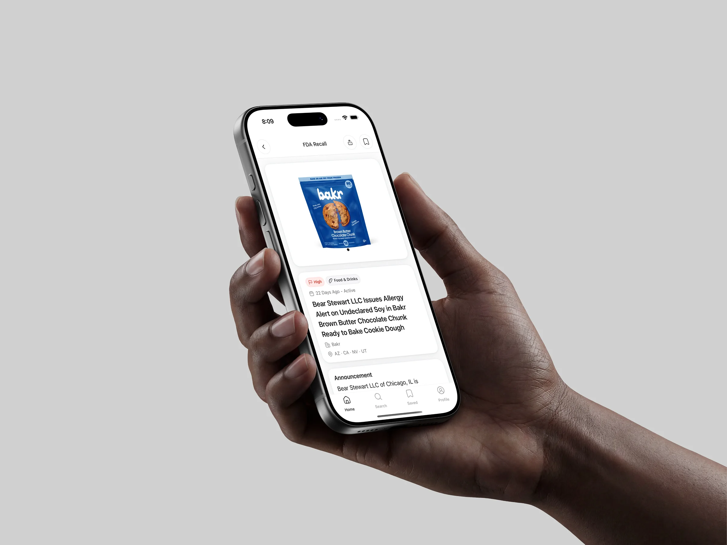
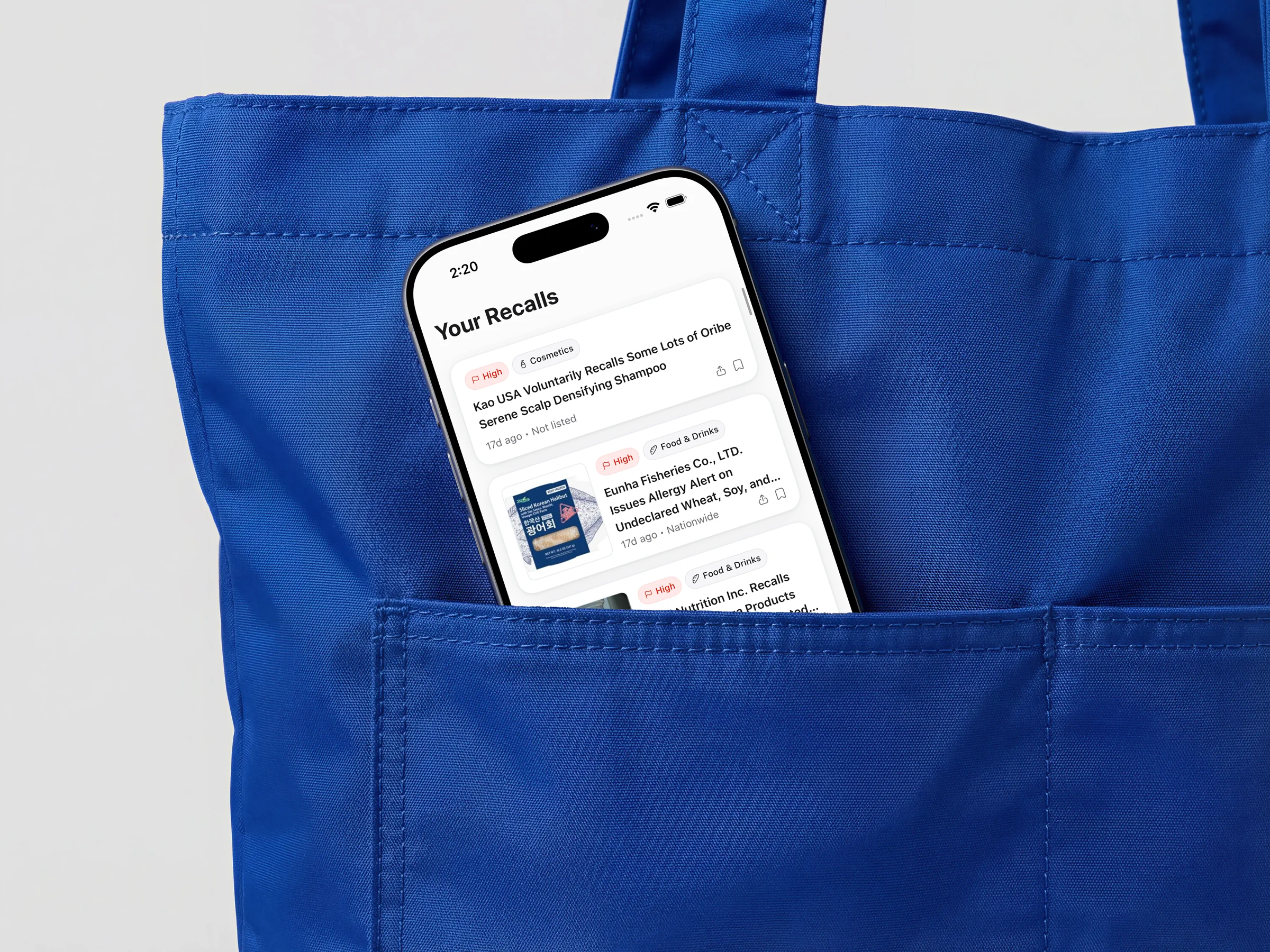
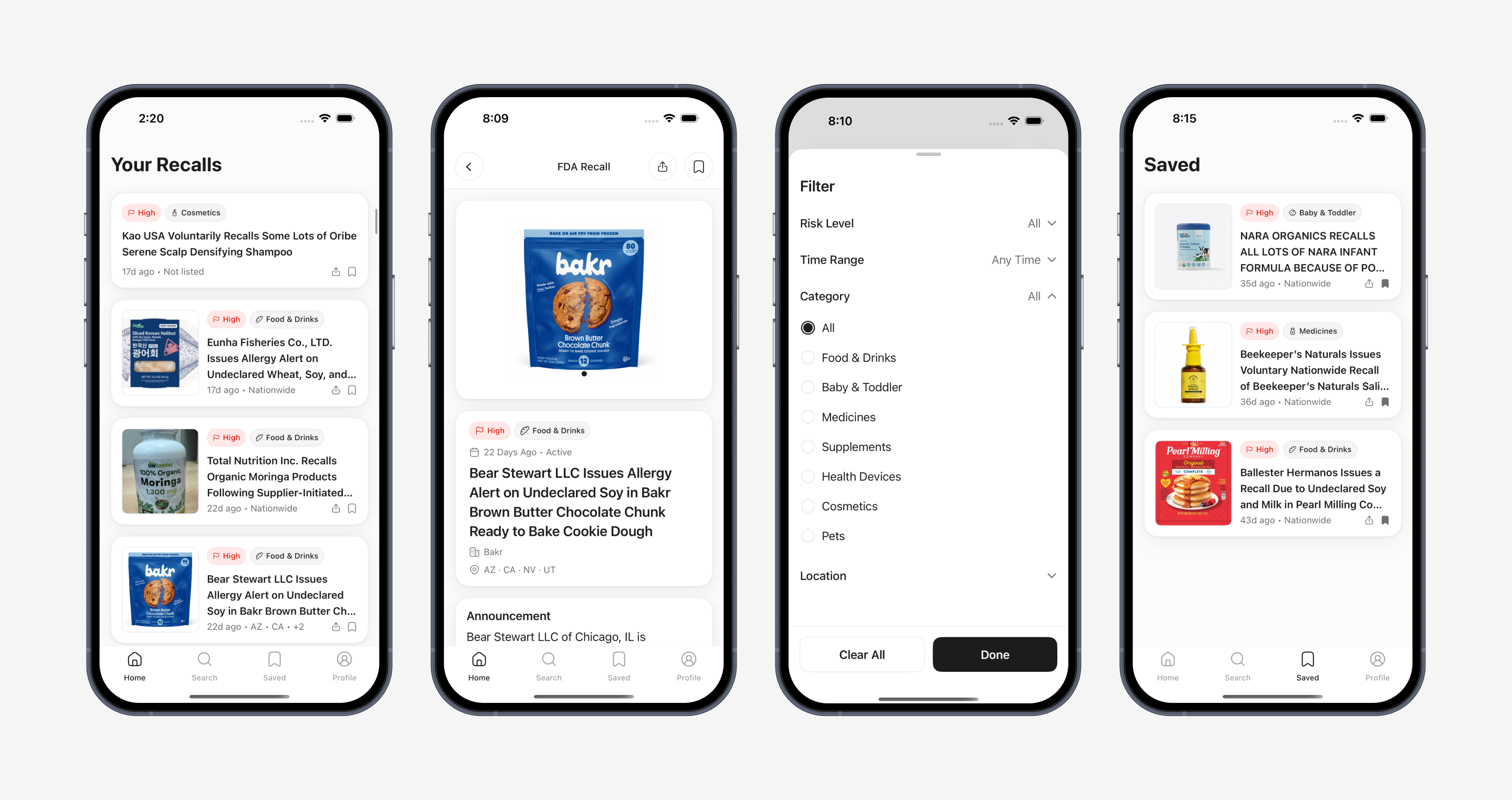
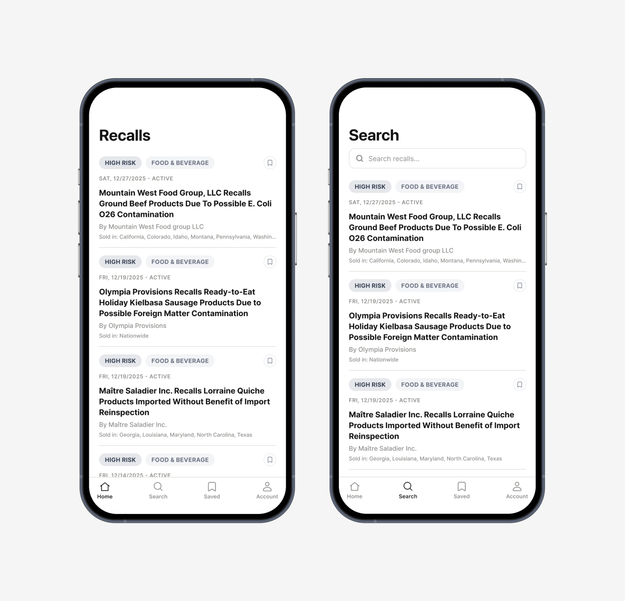
The app answers one question: does this affect me? The card answers it with the product image and the risk level. Onboarding asks what someone actually keeps at home, and those preferences drive both the feed and the alerts. Eighteen screens, live on the App Store.

I let AI map it, then lived it
ChatGPT and Claude got me oriented: which agencies publish recalls, how they get announced, and what tools already exist. That was the fastest part of the project and the least reliable. Both were confidently wrong more than once about how the recall systems actually work, so I treated what they gave me as a list of things to verify rather than as findings.
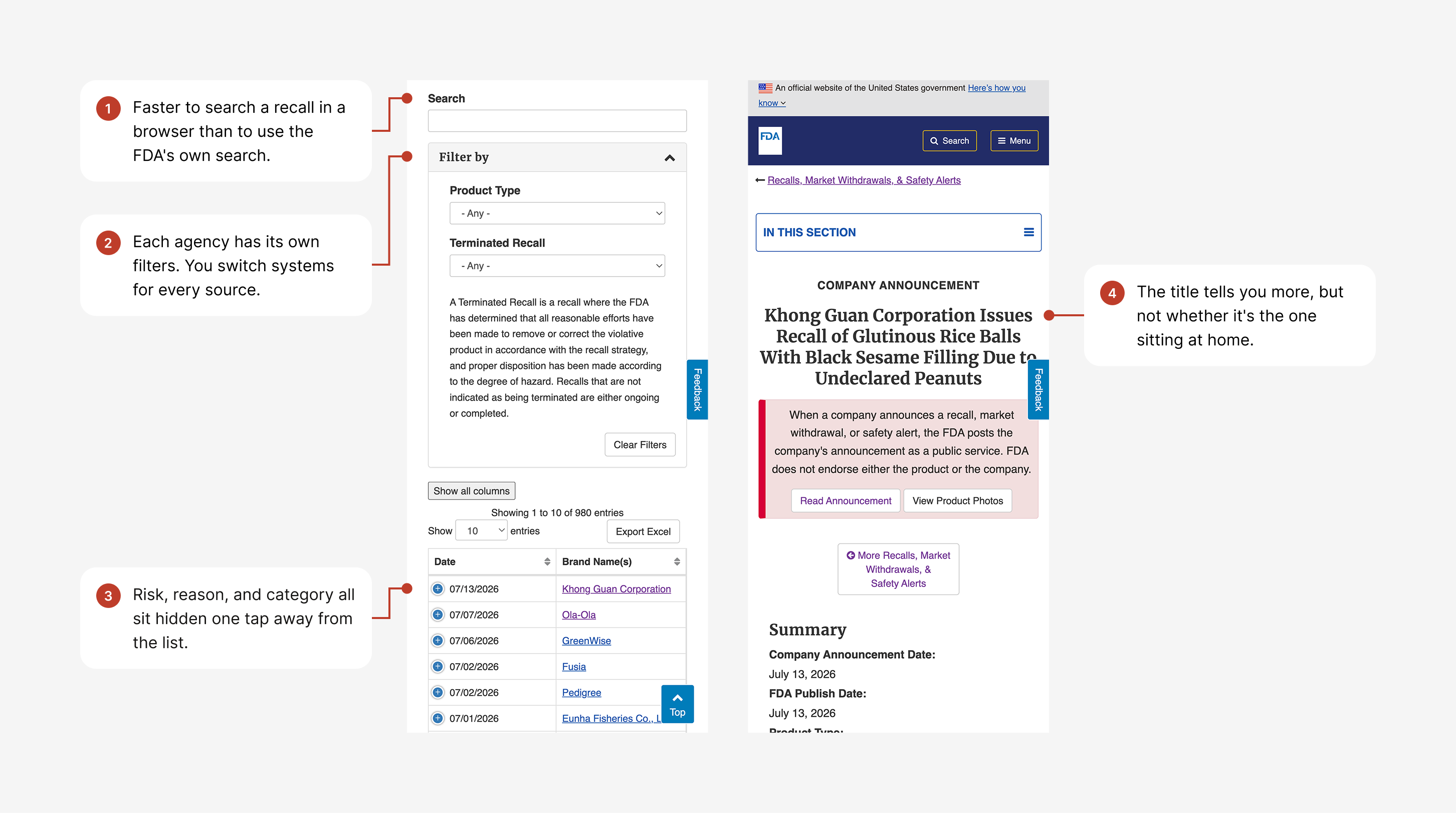
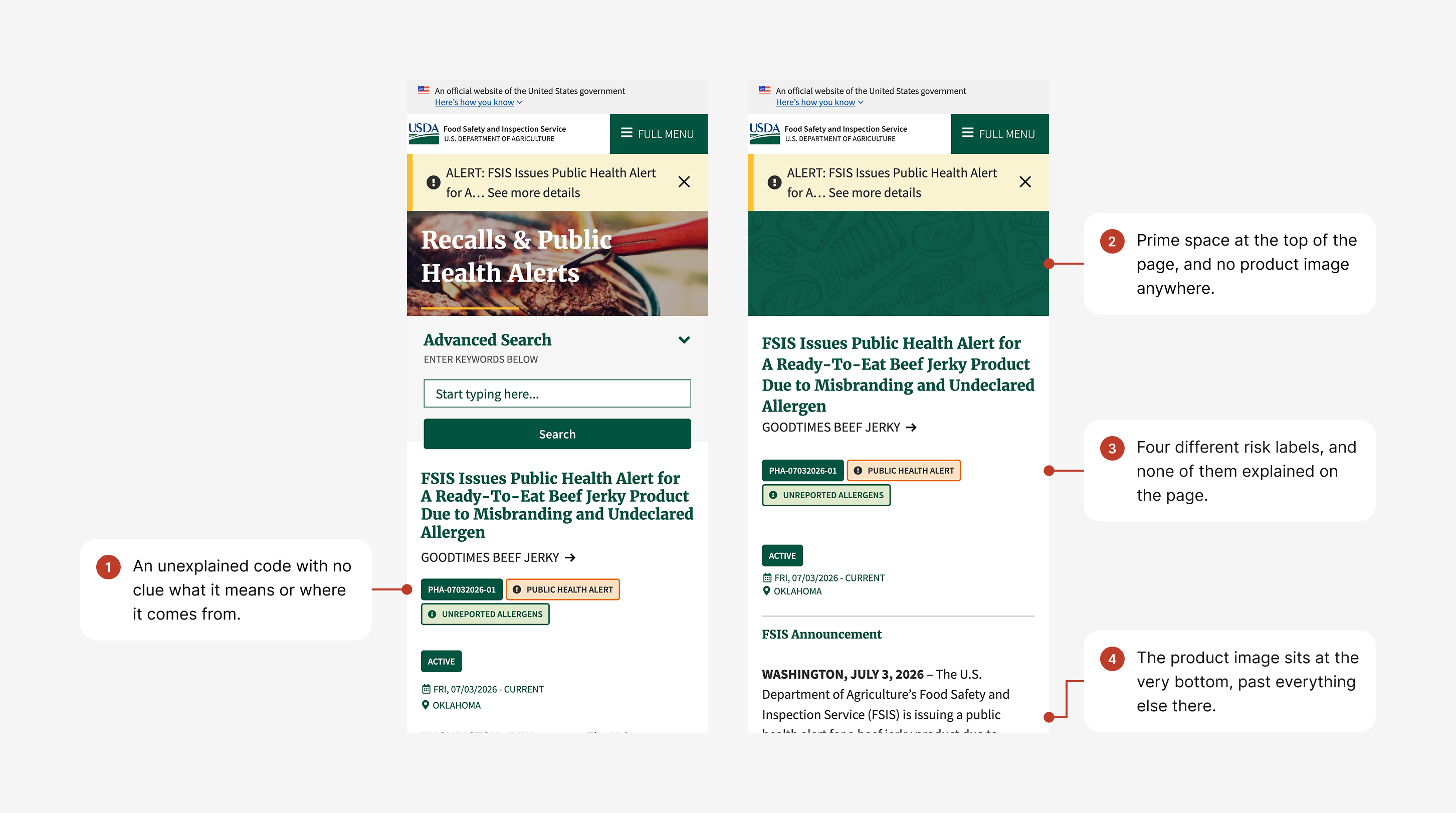
Then I went and tried to find recalls the way a person would, on both agency sites and through Google, Twitter, and news. The annotations below are what broke down, screen by screen.
The pattern across both sites was the same. Everything a person needs in order to decide whether a recall is theirs sits below or behind everything the agency needs to publish. Going through news instead, the problem flipped. Recalls arrive by accident, and usually too late. The news covers the headline cases, so most go unheard, and the covered ones tend to reach people after they have already bought or used the product.
Then I read forums and comment threads where people described recalls in their own words. The panic, the confusion, the question underneath it: is the one in my fridge the one they're talking about? The forums also told me who has the most to lose when a recall slips past. Parents, anyone with an allergy, and people who pay close attention to what goes into their body.
Two questions carried the rest of the project. How might we get a recall to someone before they buy or use the product? And how might we let someone tell, in seconds, whether a recall affects them?
One card, one second
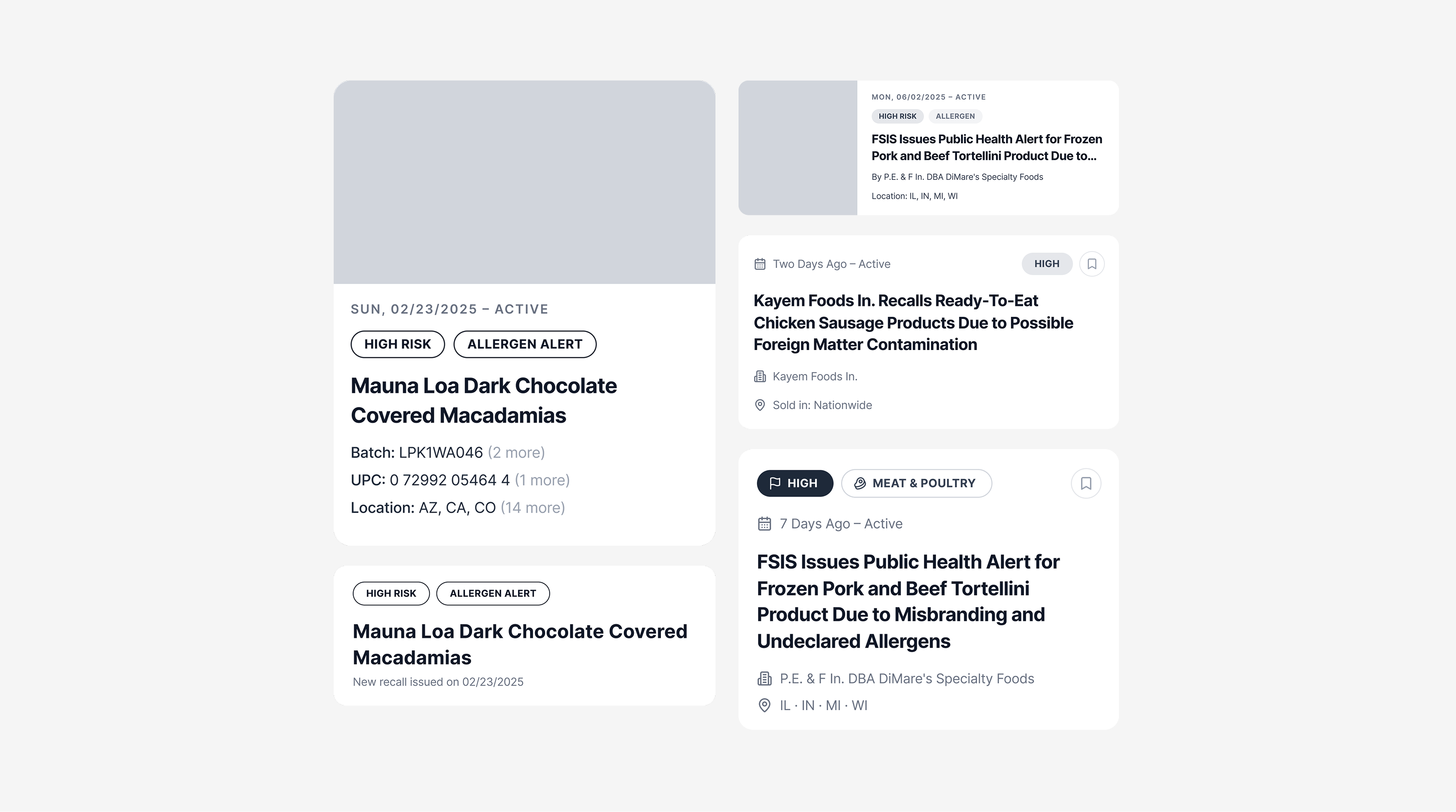
The recall card is where someone decides, in about a second, whether a recall affects them. Almost everything competes to live on it. Risk level, reason, title, batch code, UPC, location, image, company, the date it posted, status, category, and source.
I ran five treatments, each testing a different answer to what earns space on the face of the card. Batch, UPC, and location surfaced versus one tap deeper. Category as a visible pill versus hidden. Risk as an outline pill versus a solid flag. Image at full width, as a thumbnail, or absent.
The test for each element was whether a person could act on it without opening the recall.
Batch codes and UPCs failed immediately. Nobody knows the lot number of the cookie dough in their freezer, so it cannot be the thing that decides whether you tap. Surfaced on the card they also ran long, and truncating into "2 more" and "14 more" gave a reader work without giving them an answer.
Reason failed for a different cause. Nearly every recall already carries the reason in its title, so giving it a separate element meant printing the same words twice on one card.
Status failed because it describes the agency's process, not the kitchen. A recall marked closed still means the product might be on your shelf. What matters is that it was posted.
What survived answers the question: image, risk level, product, and date. Date stayed because relative time carries two things at once, whether a recall is still live and whether it is new to you since the last time you looked, which is why the card reads "7 days ago" rather than a filing date.
Risk shipped as a filled pill with the word visible, so risk never depends on color alone.
My original intent was an image-led card. A build constraint meant the version I took into testing led with the title instead. That turned out to be useful, because it let me test the assumption rather than ship it.
Five strangers, one build
Before locking the design, I took an early build to a coffee shop and a library. One round, five people: two moms with young children, a couple, and another woman. I made clear I was testing the app and not them, gave them as much time as they wanted to explore, and asked each of them the same four questions.
Five people is signal, not proof. It was enough to change the product.
The idea landed right away. The moms lit up at having one place for recalls instead of trusting whatever Facebook or the news happened to surface. The onboarding screen names the FDA and USDA as the source, and they picked up on it immediately. Knowing where the information came from was what made them trust it.
Then the specifics came back loud and clear. The version they used led with the recall title, and almost everyone wanted the image instead, because a picture, as one person put it, is faster than reading a headline. The home feed showed every recall, and personalization lived in notifications: you would see everything, but only get alerted about what you picked. People expected the opposite. They assumed their own filters shaped the home feed, and treated search as the place to hunt down a specific brand or an older recall. They also did not recognize the company on a recall. They read Bear Stewart LLC and had no idea they were looking at Bakr, the brand on the bag. And they told me what they wished it did: share a recall with family, and save the ones they would come back to.
The split in reactions taught me the most. The moms leaned in. The people with nobody vulnerable in their lives mostly shrugged. Reading it in a forum and watching it happen across a table are not the same thing. The research told me who to build for. Testing told me who to stop trying to convince.
What held up, what didn't
Four decisions defined the product. Two came out of research and held through testing. Two were plans I gave up when five people told me I had them backwards.
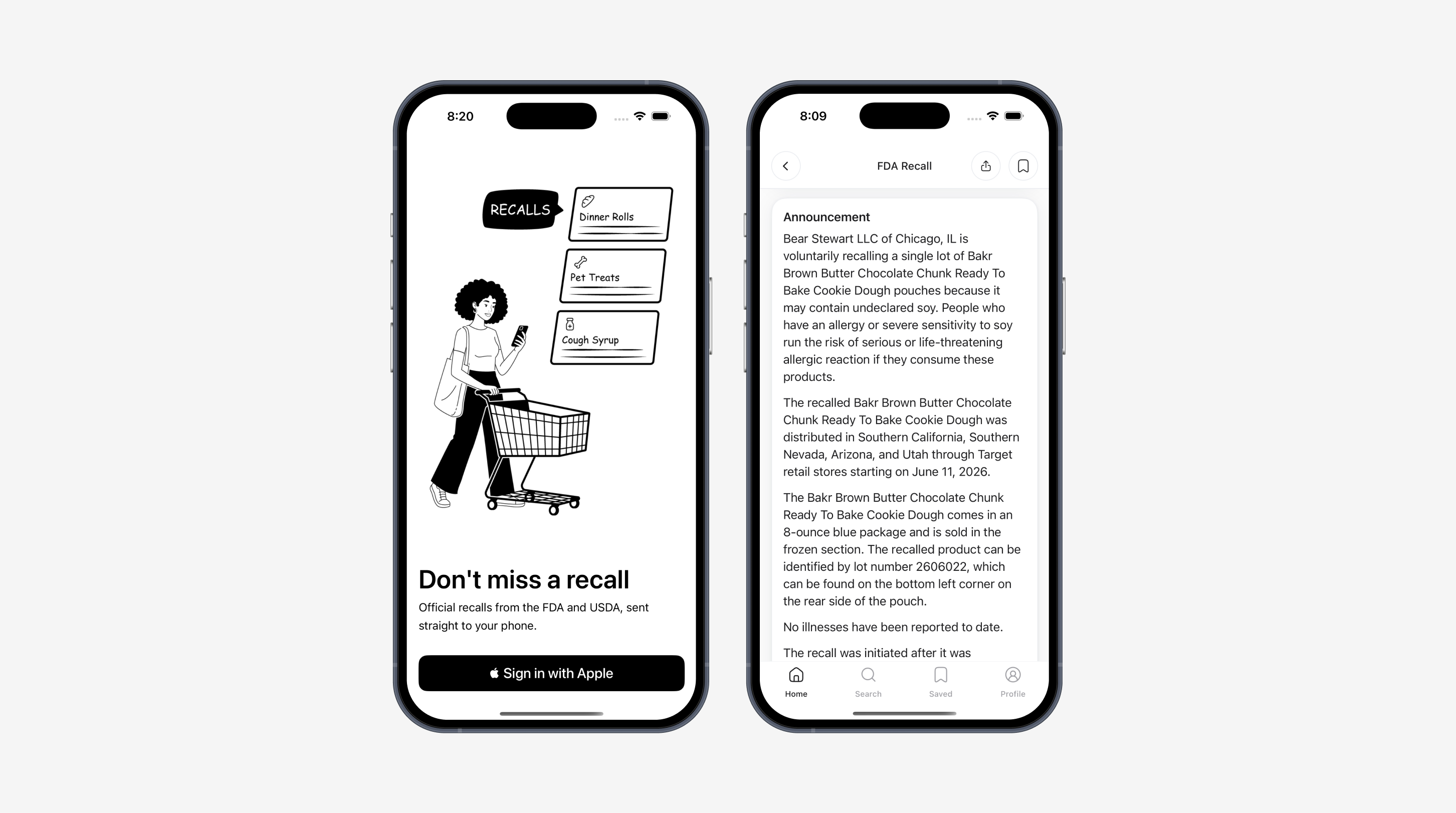
Held: official recall language
Rewriting it would read cleaner, but a user cannot verify wording that differs from the agency notice. Testers noticed the agency names on the first screen and said that was what made them trust it. The design work went into everything around the words.
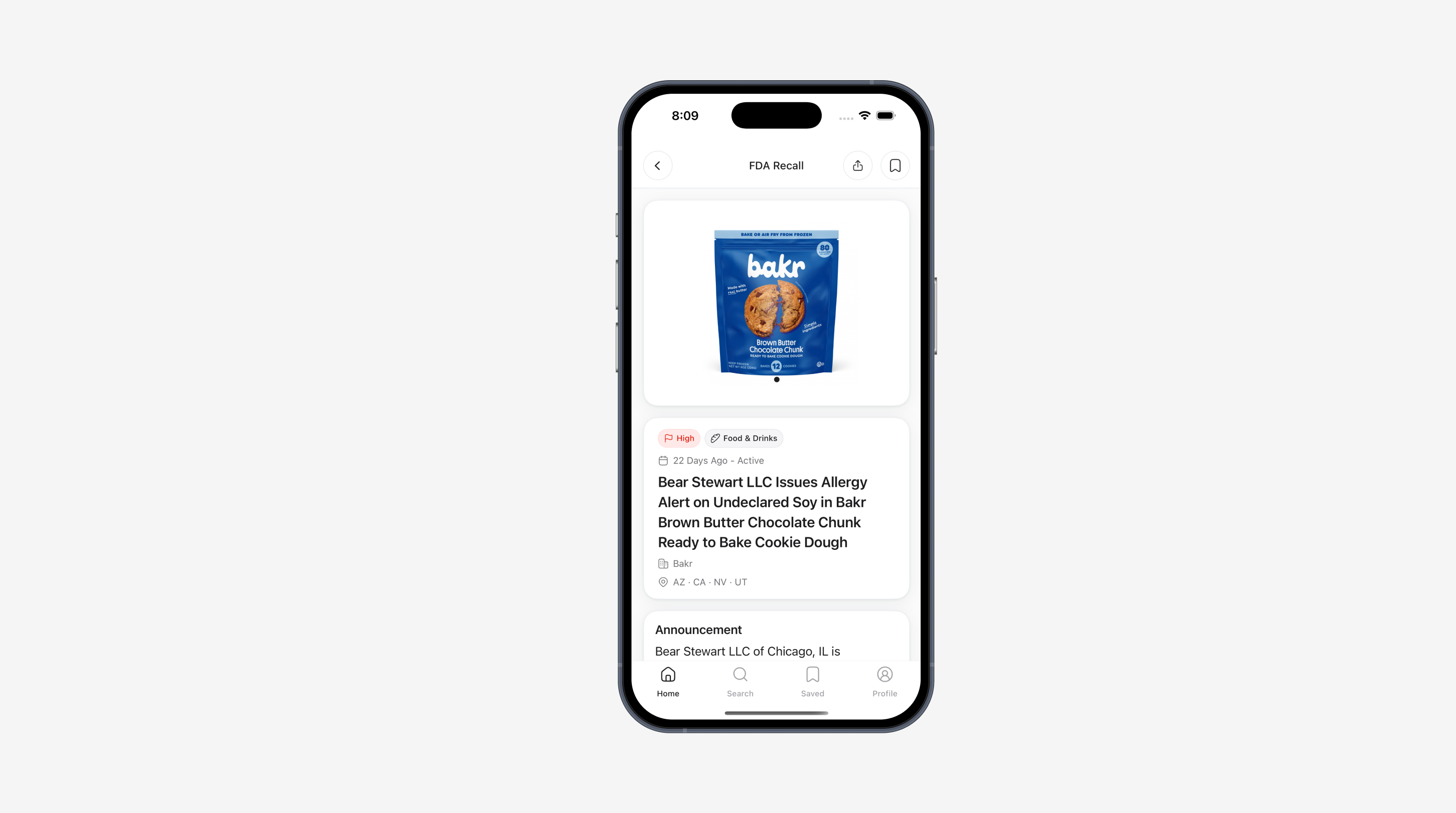
Held: the brand name people recognize
Recalls are filed under a company's legal name, and the official title carries that name into the app. Testers read Bear Stewart LLC and had no idea they were looking at Bakr. Since I could not rewrite the title, I added the brand underneath it.
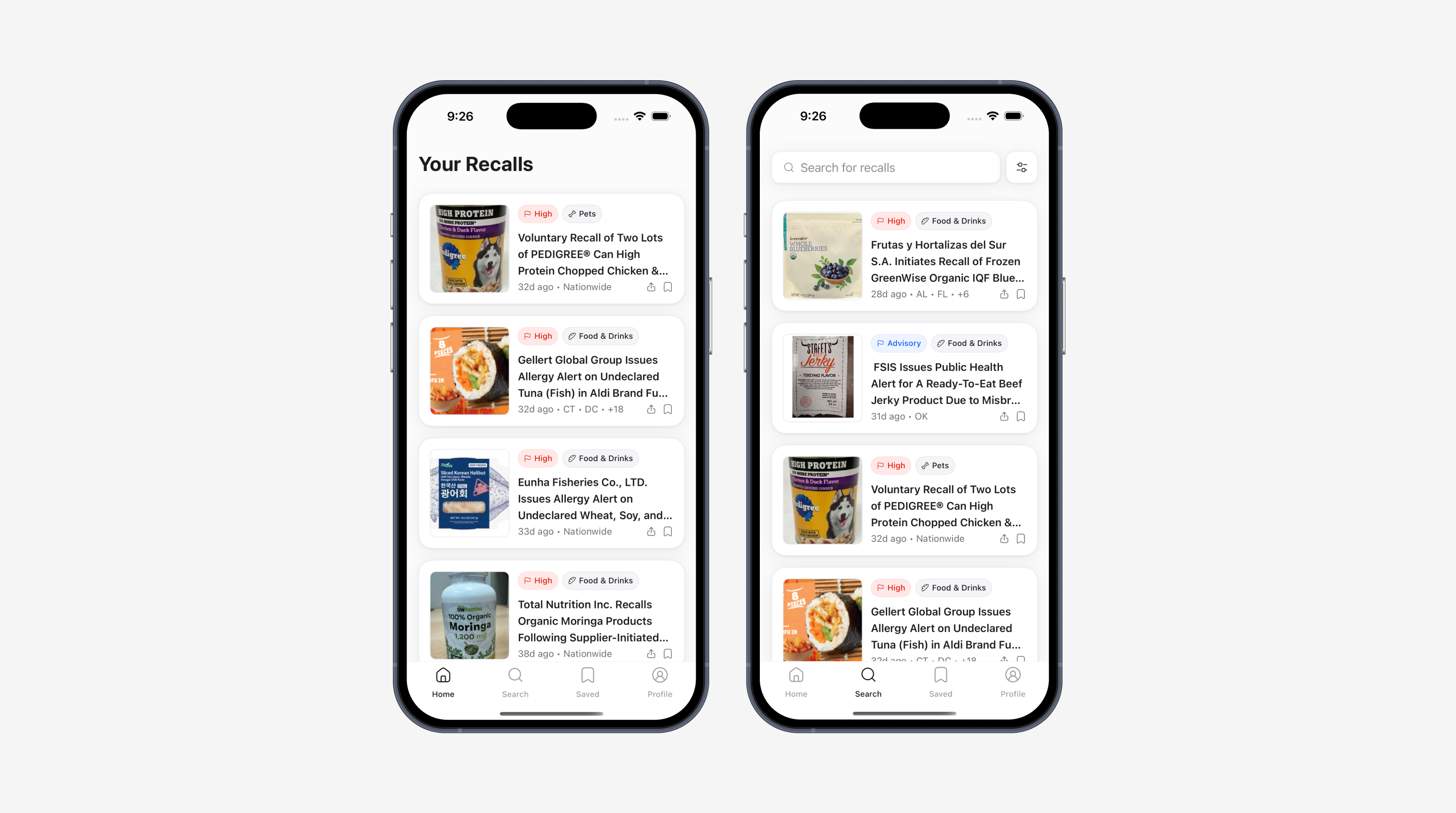
Gave up: the home feed I had planned
I built the feed to show every recall, with preferences controlling only which ones triggered a notification. All five people expected the reverse. Onboarding now asks what someone keeps at home, and those answers shape the feed itself.
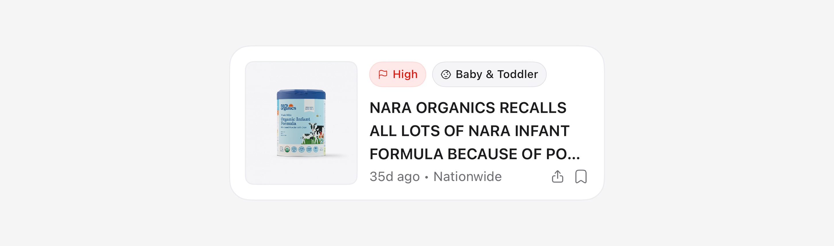
Went back: the image-led card
The card I wanted was image-first. A build constraint pushed the tested version to lead with the title, because the source photos arrive from two agencies with different backgrounds and formats and standardizing them was not what stood between me and a V1. Almost everyone reached for the picture anyway. I went back and rebuilt it, and let the constraint be a delay instead of a decision.
Testers asked for two things I had not planned: share a recall with family, and save the ones they would come back to. Both went in. Notifications were always in scope, but a tester asking whether the app would spam him turned alert scope into a setting rather than a default. One thing I did not build at all: pulling in grocery loyalty data so the app would know what someone had actually bought. That is the best version of this product, and it would have meant holding the app until retailers agreed to participate. An app nobody can use is worth less than a smaller one that ships.
Shipped, and still shipping
Recall Watch is live on the App Store at v1.5.0. Eighteen screens, built solo in Swift, and updated since release. I have not marketed it, so usage is what you would expect from an app nobody has been told about. Building and shipping it was the goal.
The work now is distribution. Getting the app in front of the people who need it, starting with my own community, then watching reviews and real usage as they come in, fixing what breaks and sharpening what people lean on most.
Where AI helped
This project taught me the line between AI as a production tool and AI as a thinking partner. It made the early work fast: mapping the problem, examining data structures, getting unstuck on Swift. Working solo, it was a useful sounding board when there was no one else to argue with. But I take its opinions with a grain of salt and follow up with my own research, because it was confidently wrong more than once about how the recall systems actually work.
Understanding the people I was building for did not come from a model. It came from five short conversations in a coffee shop, and those conversations are what changed the design.