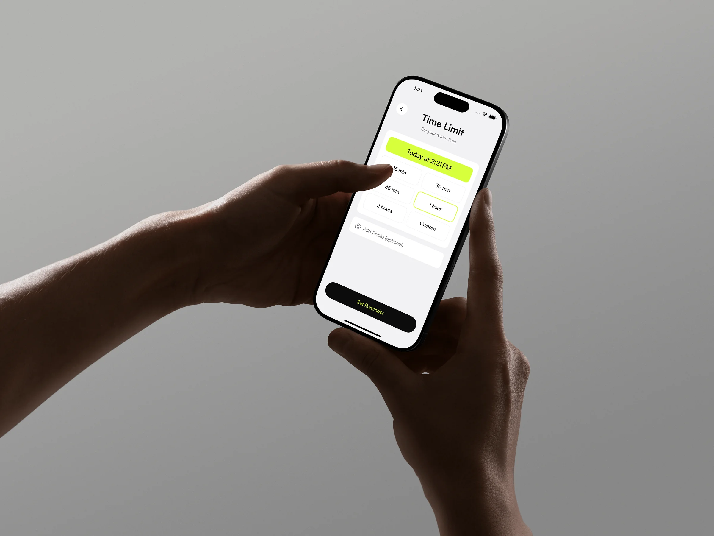
CurbTime
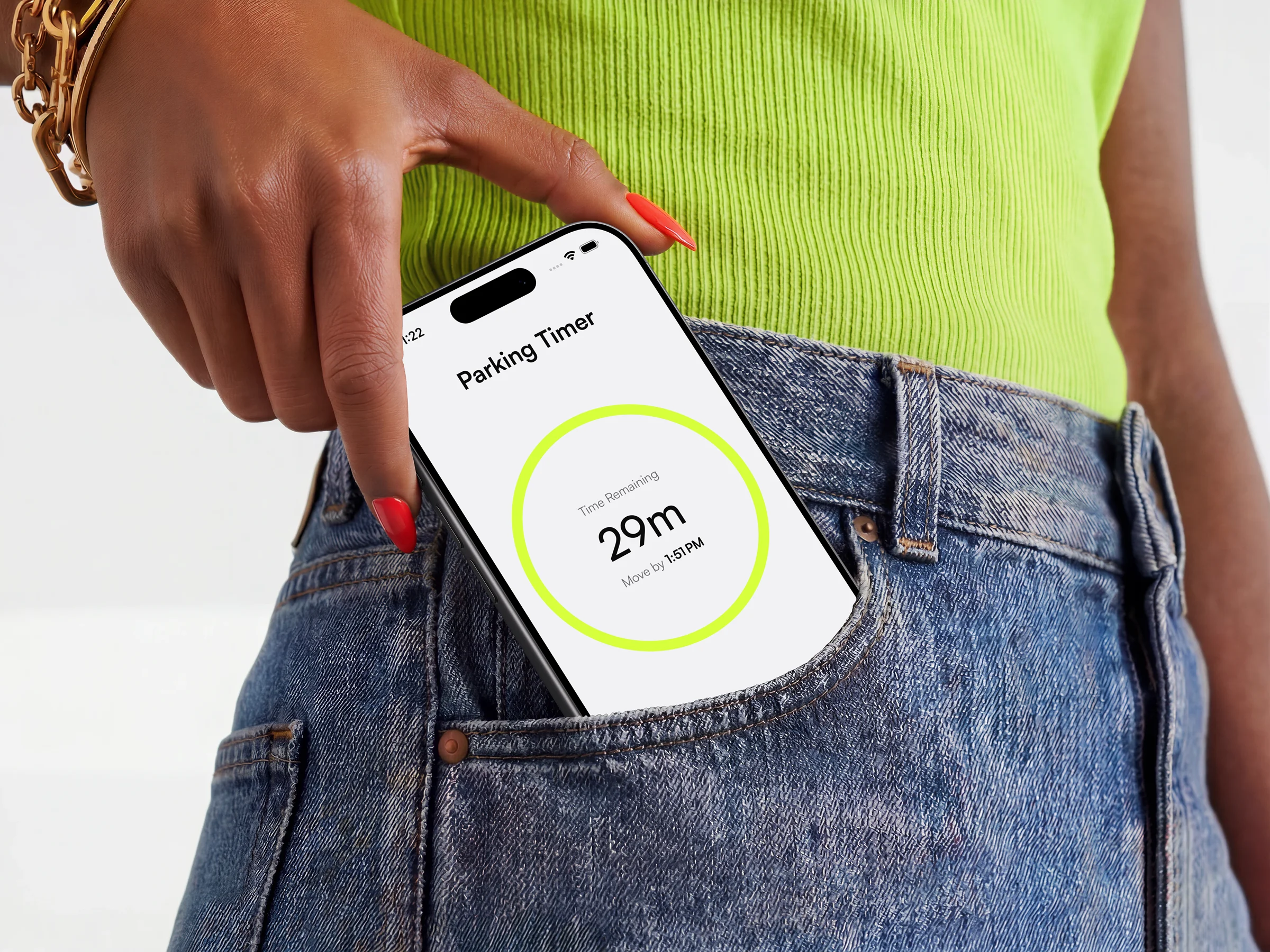
Nobody plans to get a ticket. They lose track of time.
CurbTime is a parking timer for street parking. You park, read the sign, set the window, and the app gets you back before the ticket does. I founded it, designed it, and built it in SwiftUI on my own, from first research through App Store release.
Street parking means doing the mental math for when you have to be back, then checking the clock all day to make sure you have not gone over. Every app in this category tries to solve it with data: crowdsourced rule maps, city cleaning schedules, automatic parking detection. CurbTime does the math once and watches the clock, and it never tells you anything you did not tell it first.
Four screens, no tabs, no accounts, no onboarding. Live on the App Store.

A tax on forgetting
I used Claude to map the problem fast, then checked its claims against real city data, because an AI telling me something is not a source. The public numbers turned out starker than the model suggested.
Los Angeles issued 241,881 street cleaning citations in the first half of 2024, 26.25% of every parking ticket it wrote, at $73 each. Crosstown LA found that in the city's own citation data. In San Francisco, SFMTA told the Examiner that street cleaning accounts for 55% of all parking citations. This is a tax on forgetting, and dense cities collect it every day.
The competitive landscape taught me more than the numbers did. Sorting what was on the App Store, the category splits into four jobs: find parking, pay for parking, remember where I parked, and time my parking. Only the last one touches the moment I care about, and almost everything in it makes the same bet: know the rules for the user. Crowdsourced maps, published cleaning schedules, automatic detection.
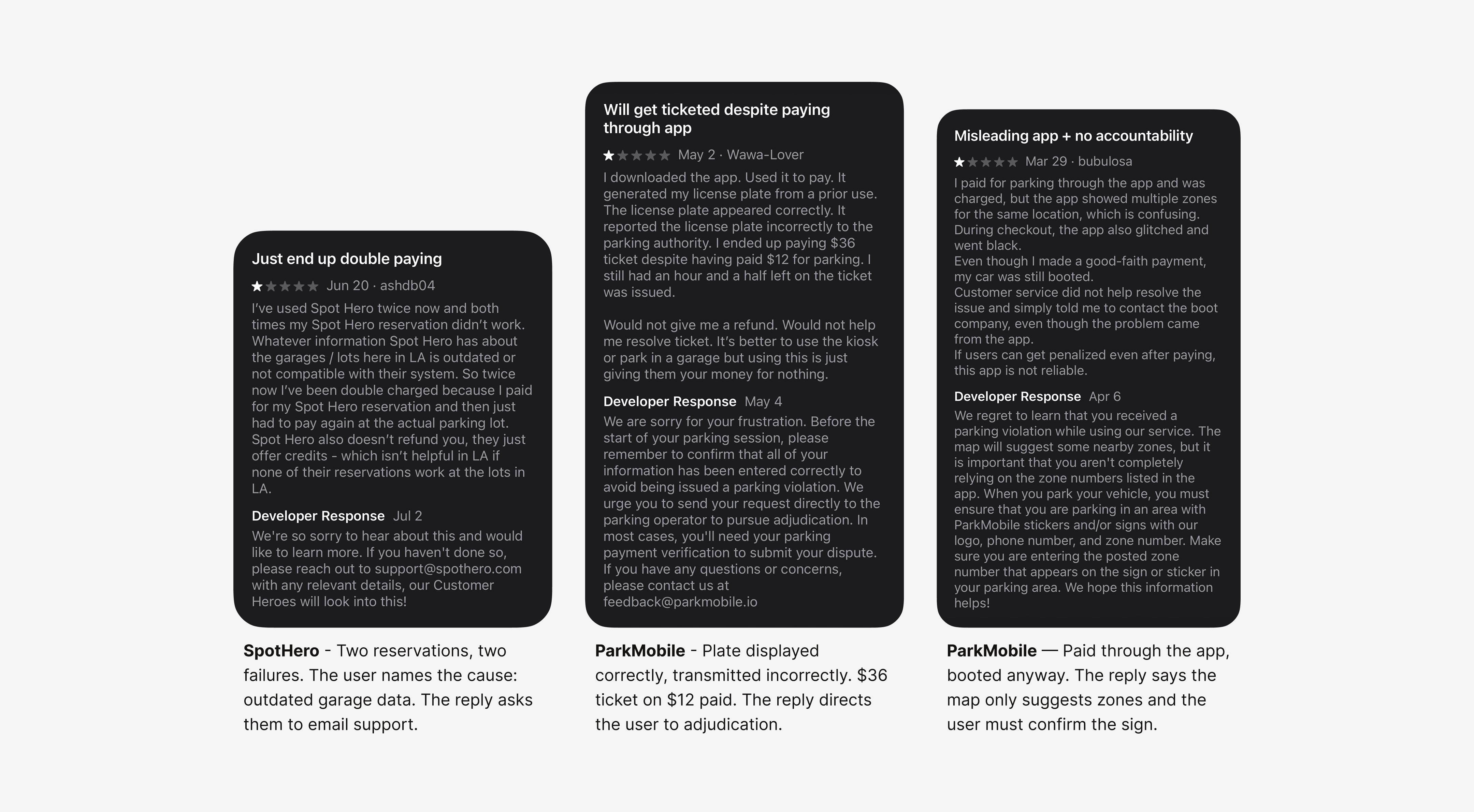
That bet carries a cost. Coverage has gaps, schedules go stale, and the moment the data is wrong the app has caused a ticket instead of preventing one. One competitor says so on its own store listing, telling users to double-check the posted sign before relying on its schedule. Their reviews say it louder. Across ParkMobile and SpotHero, the same failure repeats: the user follows the app, the app's information has drifted from reality, and the user pays the fine while the company points them to the sign, the parking operator, or a support inbox. These are payment and reservation apps, not rule-lookup apps, and I read their reviews for the failure mode rather than the feature set. An app that is wrong about parking is worse than no app at all.
One screen, standing at the curb
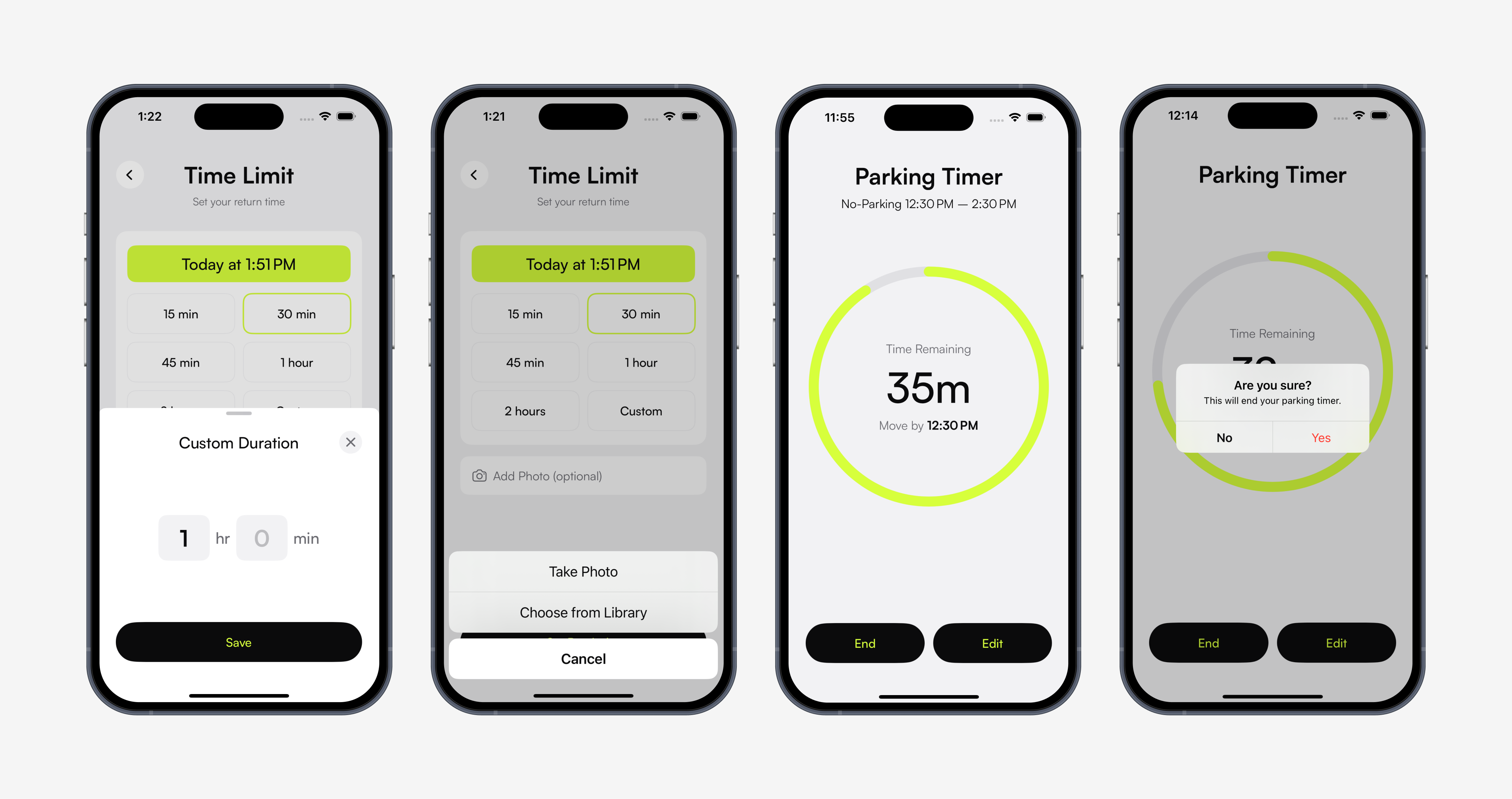
The core of the app is a single screen: setting the timer right after parking. Everything about it is shaped by where the person is standing when they use it. Car locked, keys in hand, already half walking away. Every extra field is a reason to skip it and trust memory instead.
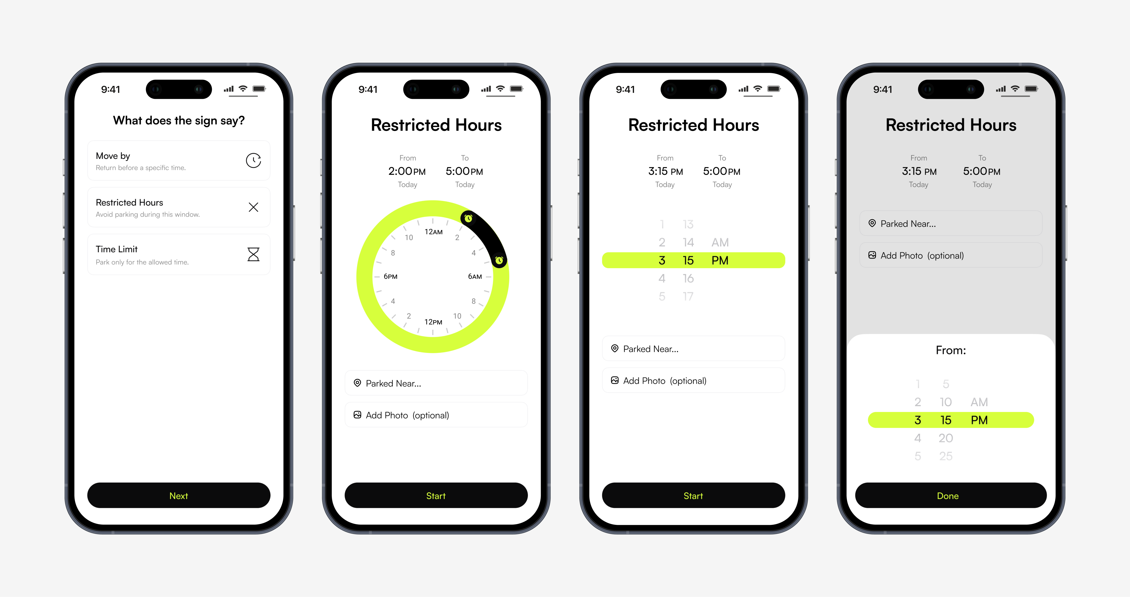
Two things did not survive that. A location field, because people know where they parked and the problem I am solving is time, not place. And a separate "Move by" mode. It did the same thing the time-limit mode already did, so all it added was a question at the start: which one am I supposed to pick, and what happens if I pick wrong. Nobody should have to answer that before they can set a timer.
What survived are the two situations that are genuinely different. A time limit, where you know how long you have. A no-parking window, where you know when the restriction starts and when it lifts.
Then the harder question. How does someone actually enter a time on a curb.
A dial. A 24-hour ring you drag to set start and end. It was the best-looking thing I made and the first thing I cut. Dragging needs steady, precise control, which is exactly what someone with shaky hands does not have. And a whole day has to fit around one circle, which leaves each minute about the width of a hair. You can get close to 3:16. You cannot land on it, and close is not good enough when the cost is a ticket.
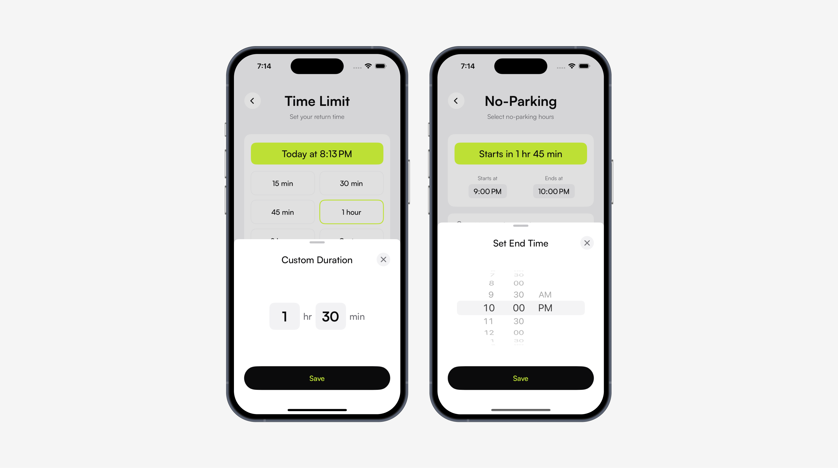
A wheel. The iOS default, and what Apple's own Clock app uses to set an alarm. Accurate, familiar, and slow. Parking times are not spread evenly across the hour. They cluster at fifteen, thirty, and sixty. A minute-by-minute wheel makes someone scroll past twenty-five values they will never pick to reach one they will.
A wheel behind a tap. The same wheel, hidden until you tap the time. The screen looks calmer, but the one thing it exists to do is now a step away, and the person doing it is walking away from their car. As the only way in, this was wrong. It turned out to be right as a backup, which is where it ended up.
None of the three worked alone. What worked was giving up on one control doing both jobs.
A duration means the same thing everywhere. A no-parking window does not. Fifteen minutes is fifteen minutes in any city, so the app can offer it. The hours on a no-parking sign come from the sign in front of you, and they could be there for street cleaning, rush hour, a school zone, loading, snow, or a temporary posting that went up yesterday for a move or a film shoot. The app has no way to know which, and a sign posted yesterday cannot be in anyone's data. So the no-parking side suggests nothing. You enter both times off the sign, in thirty-minute steps, because posted hours land on the hour or the half hour. The cost is that a sign reading 7:45 cannot be entered exactly.
Both screens do the math for you. Set a two-hour limit and it shows the time you need to be back. Set a no-parking window and it shows how long you have before it starts. Losing track of a parking deadline usually starts with doing that math wrong, so the app does it and shows the answer before you commit.
Four times I chose the harder path
Each of these had a simpler or flashier default available. The through line is that the app is never allowed to be the source of the mistake.
Held: you are the source of truth
Reliable city data barely exists. Cleaning hours and parking windows are not published anywhere consistent, and assembling them means digging through scattered city websites with no way to know whether any of it is current. In this product a wrong answer does not just fail, it causes the ticket. So the app asks the person standing in front of the sign, and it works on any street in any city. You can still mistype a time, which is one more reason the timer stays editable, but the app will never hand you stale data with confidence.
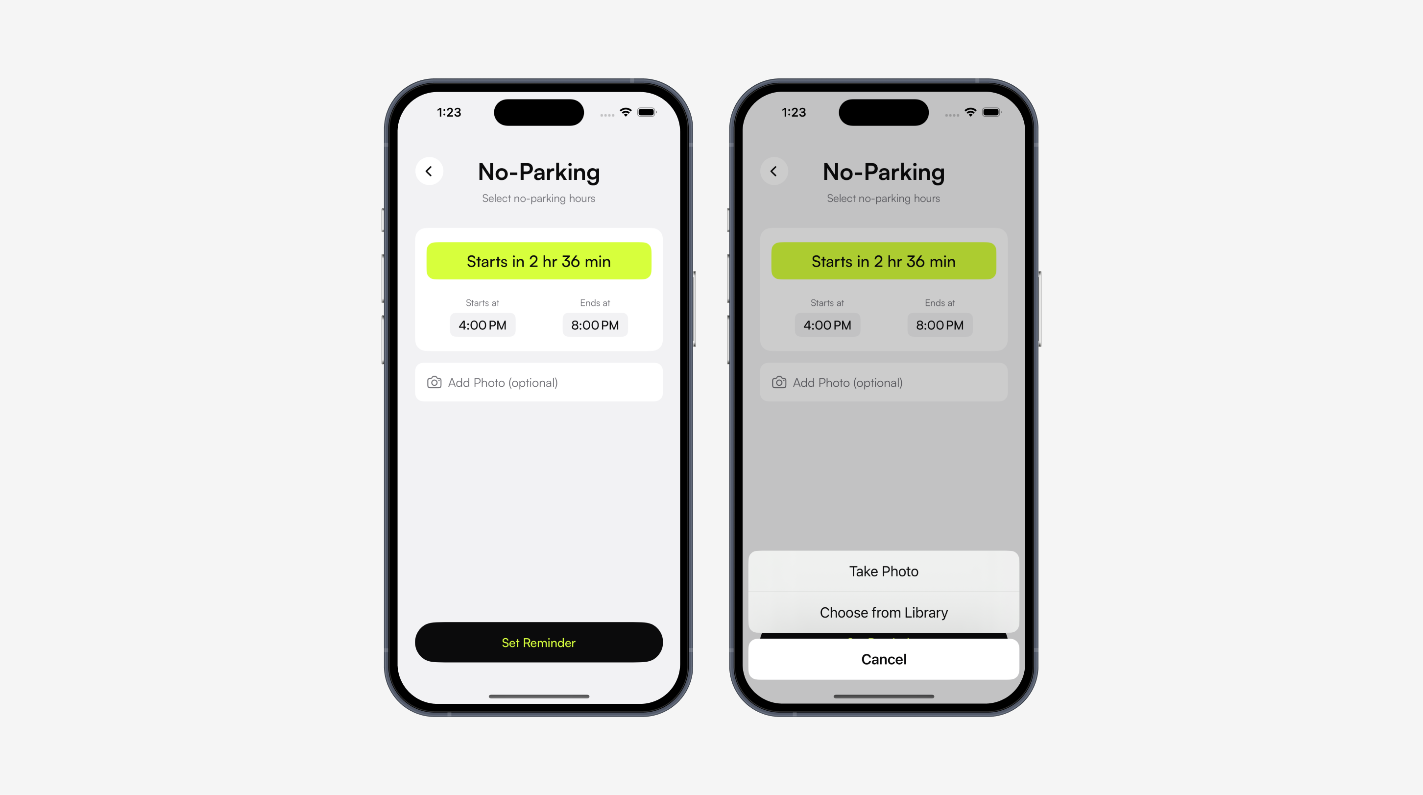
Held: a photo of the sign
After leaving the car, people second-guess what they read. You can snap the sign while setting the timer and reread it any time, with a full-screen viewer and a retake if the first shot is unreadable. It costs one tap at setup and removes the walk-back.
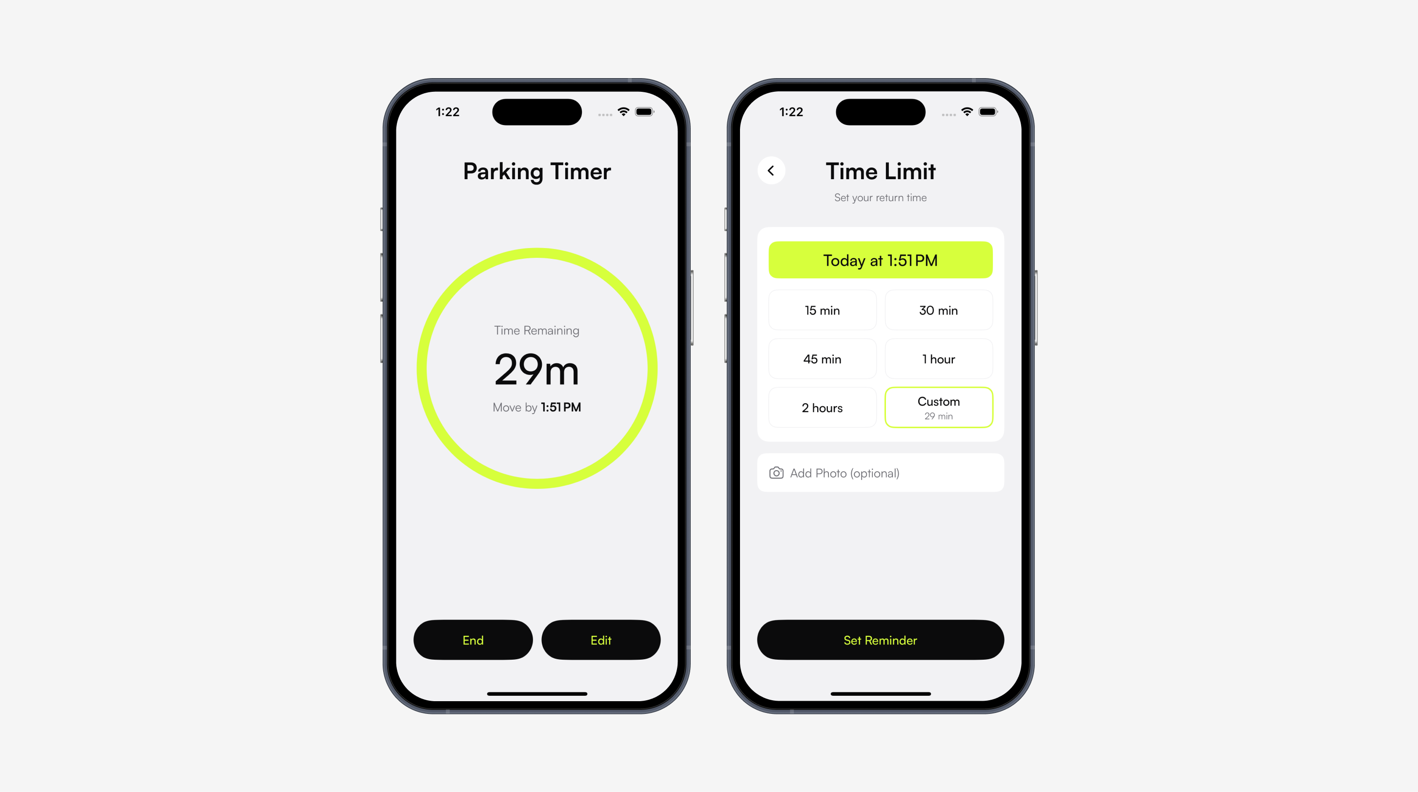
Gave up: a timer you set once and leave alone
Plans change. Someone feeds the meter, or moves the car and gets a fresh window. I had built the timer as a commitment, and a reminder that cannot keep up with the day gets abandoned by lunchtime. It is now editable at any point.
Went back: the countdown belongs outside the app
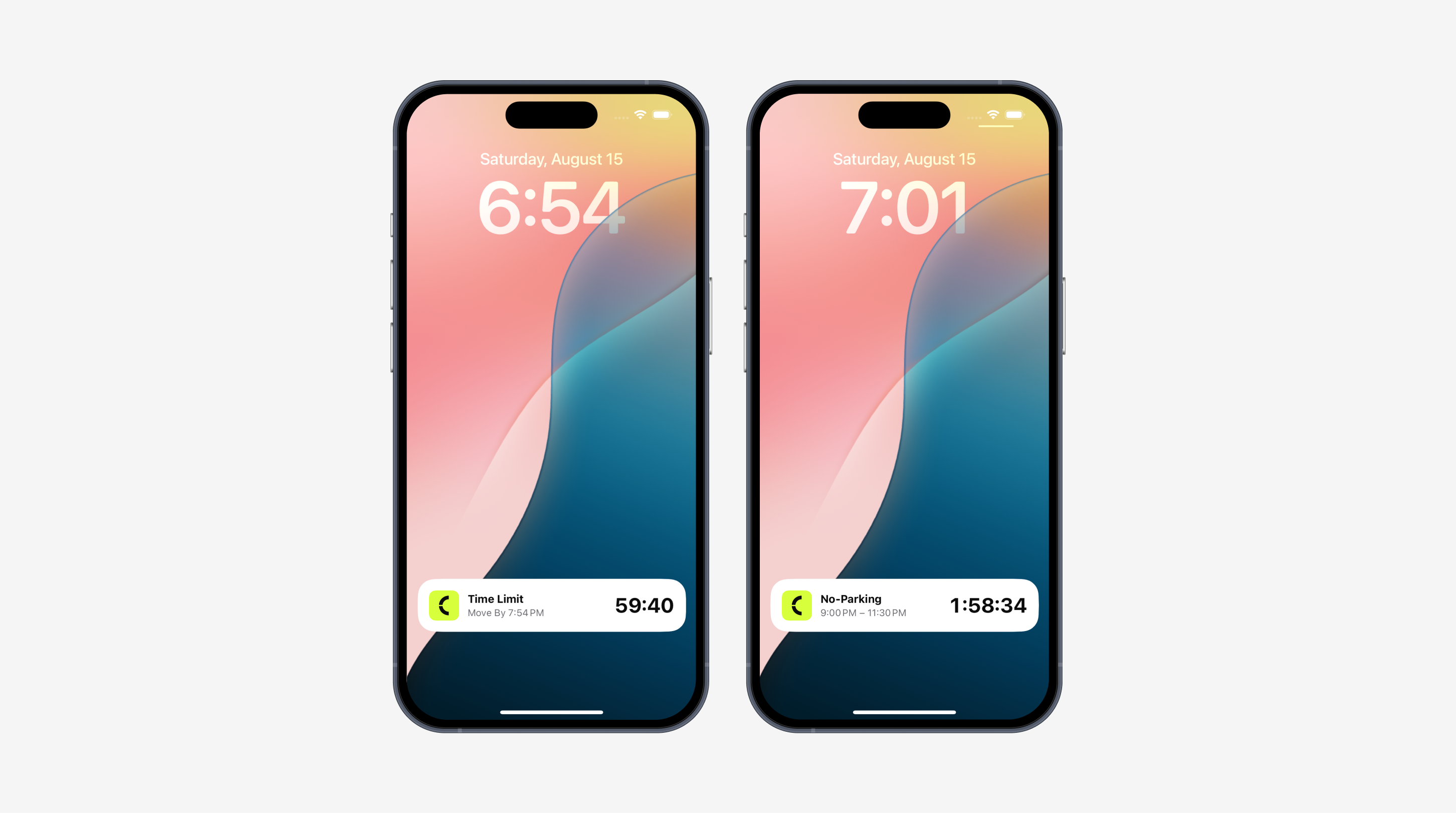
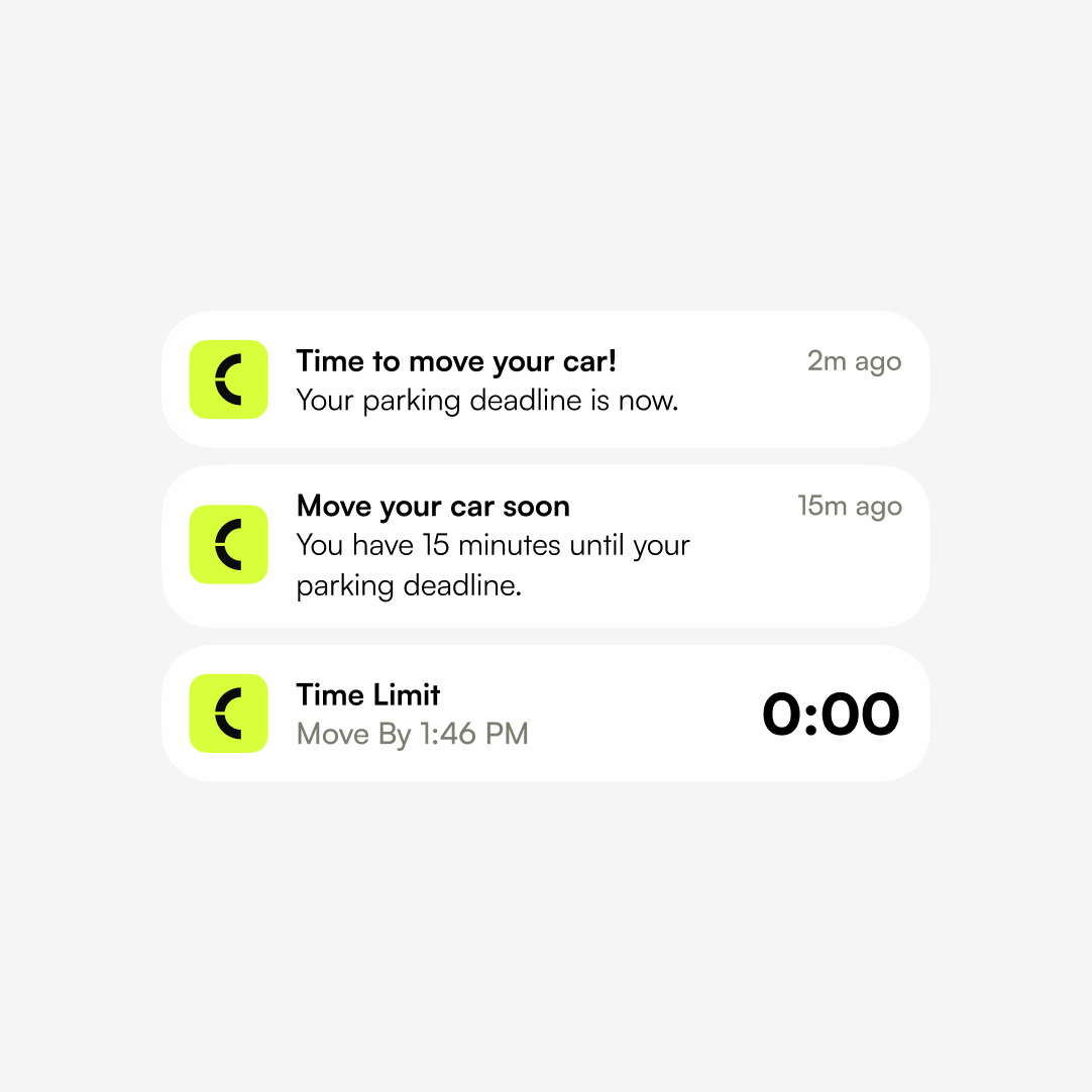
Checking a timer means unlocking the phone and opening an app, which is exactly the friction that makes people rely on memory instead. The countdown moved to a Live Activity on the lock screen and Dynamic Island, showing time remaining and the exact move-by moment. The alerts behave like an alarm rather than a calendar reminder: a fifteen-minute warning with enough time to wrap up and walk back, then a final alert at the deadline.e image-led card
Shipped small, on purpose
CurbTime is live on the App Store, about six weeks from the first Figma frame to the final commit. Four screens in a deliberately linear flow, with no tabs, accounts, or onboarding. Two setup flows converging on one active timer. Sign capture from camera or library with a full-screen viewer and retake. Live Activity and Dynamic Island countdown, a fifteen-minute warning, and a deadline alert. Around 2,100 lines of SwiftUI.
The app shipped without outside testing, and that is the first thing I want to fix. It was a scope call for a build this small, but even a single-purpose app needs someone other than its designer to use it. Before I add anything, I want real people on it.
After that comes optional local intelligence: city cleaning schedules, and location to remember where you parked. Version one deliberately knows nothing about your city, which is why it works in every city. Every future addition has to clear the same bar. It can help, but it can never be the reason you got the ticket
Research told me what not to build
The easy path was another app stuffed with parking data, and the research is what talked me out of it. Most of the category was betting on knowing the rules for the user, and the failure mode of that bet is the exact outcome the user is paying you to prevent.
When I started, the timer bucket was nearly empty. A year later the App Store is full of them. I would rather have been early on a real problem than right about a crowded one.
Not every problem deserves a twelve-week process. This one was clear cut, the research confirmed its shape quickly, and that let me design and ship with very little guessing. CurbTime is the smallest thing I have shipped, and that is the point. Knowing how big a solution needs to be is a design decision too.