Canopy
Five tools for one client, and the client feels every seam.
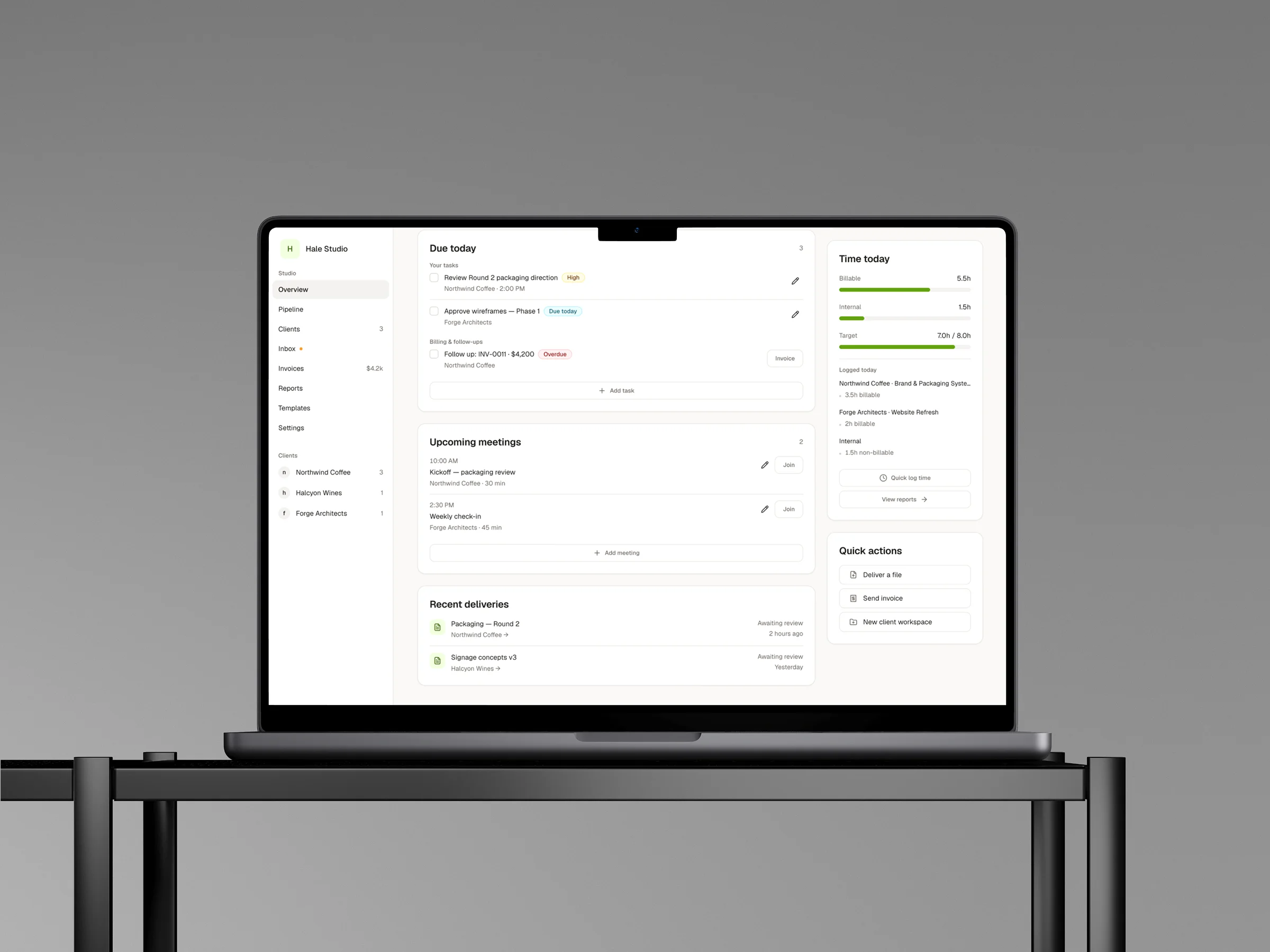
Canopy is a client portal platform for freelancers and small agencies. One place to sign, pay, review work, and see where a project stands, instead of stitching it together from four subscriptions. I designed it and built the front end on my own.
Freelancers run each client across email, file storage, video calls, an invoicing tool, and whatever holds the project plan. The freelancer absorbs the switching cost. The client absorbs something worse: every app in the stack has its own look and its own login, so the experience feels assembled from parts, because it is. For a freelancer, that experience is the brand.
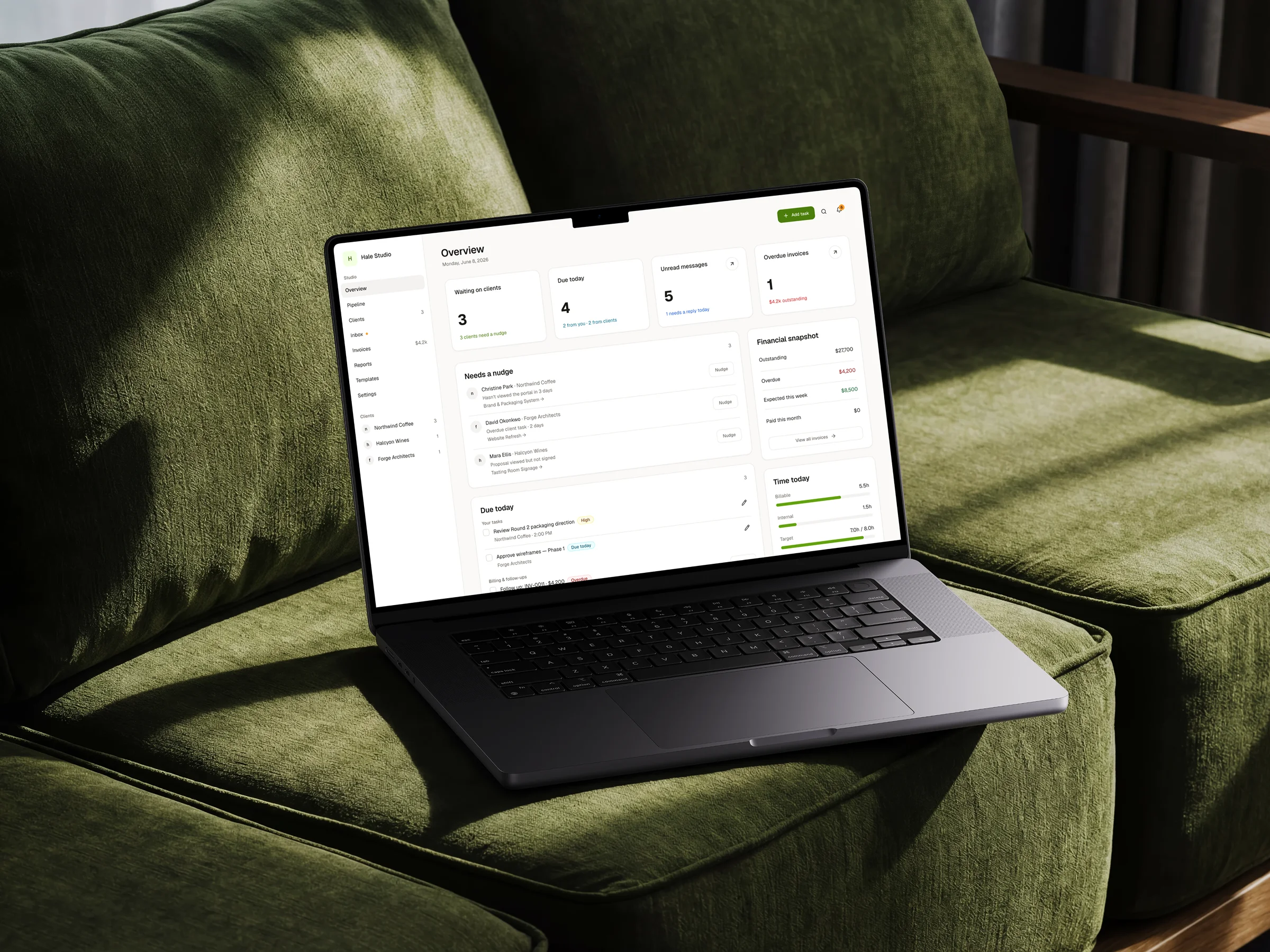
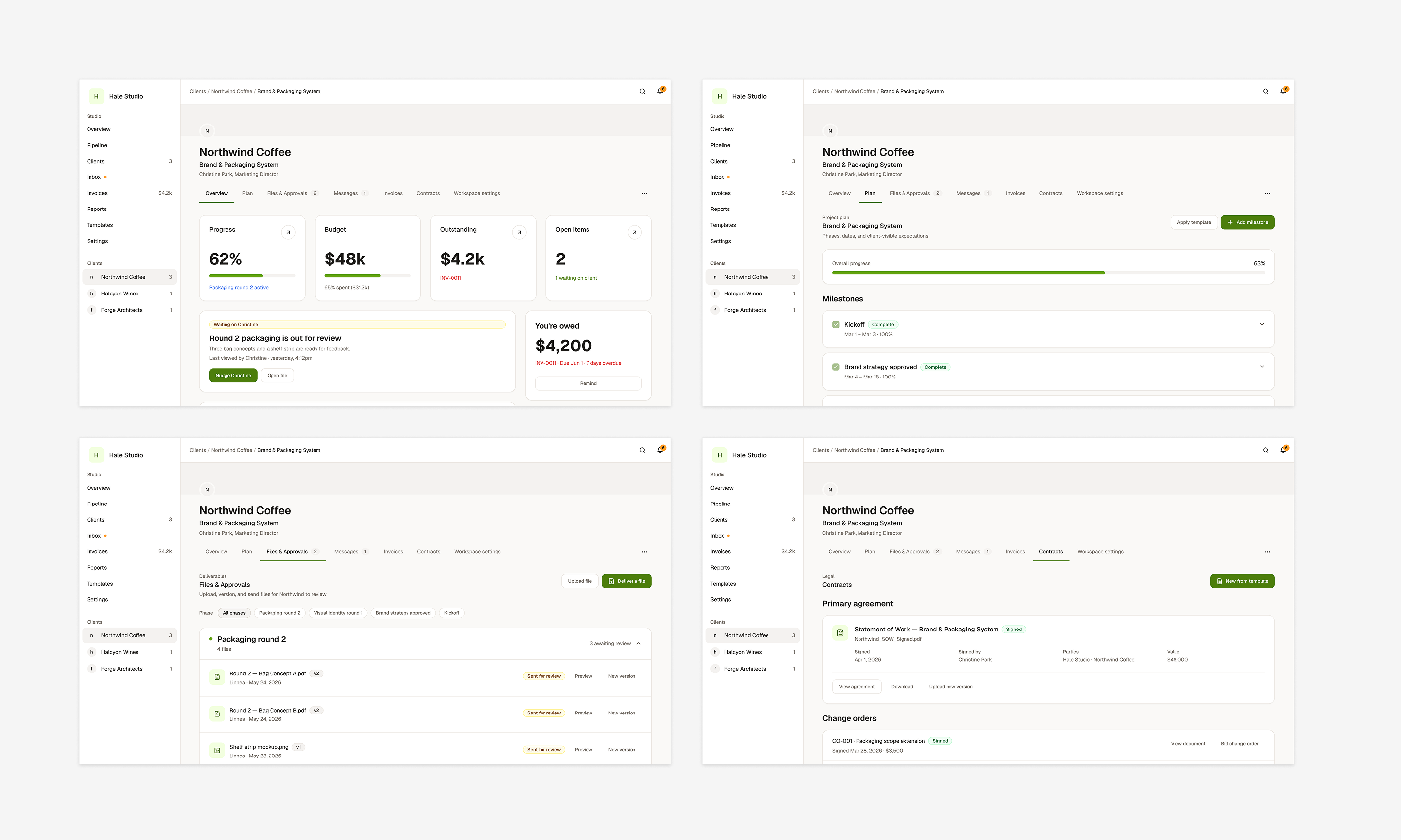
What exists is the freelancer's side, built end to end. Seven studio pages plus settings, seven tabs inside every client workspace, template builders for plans, contracts, proposals, and questionnaires, and a token-driven design system. Front end only, running locally, not yet deployed.
One bad month is not a market
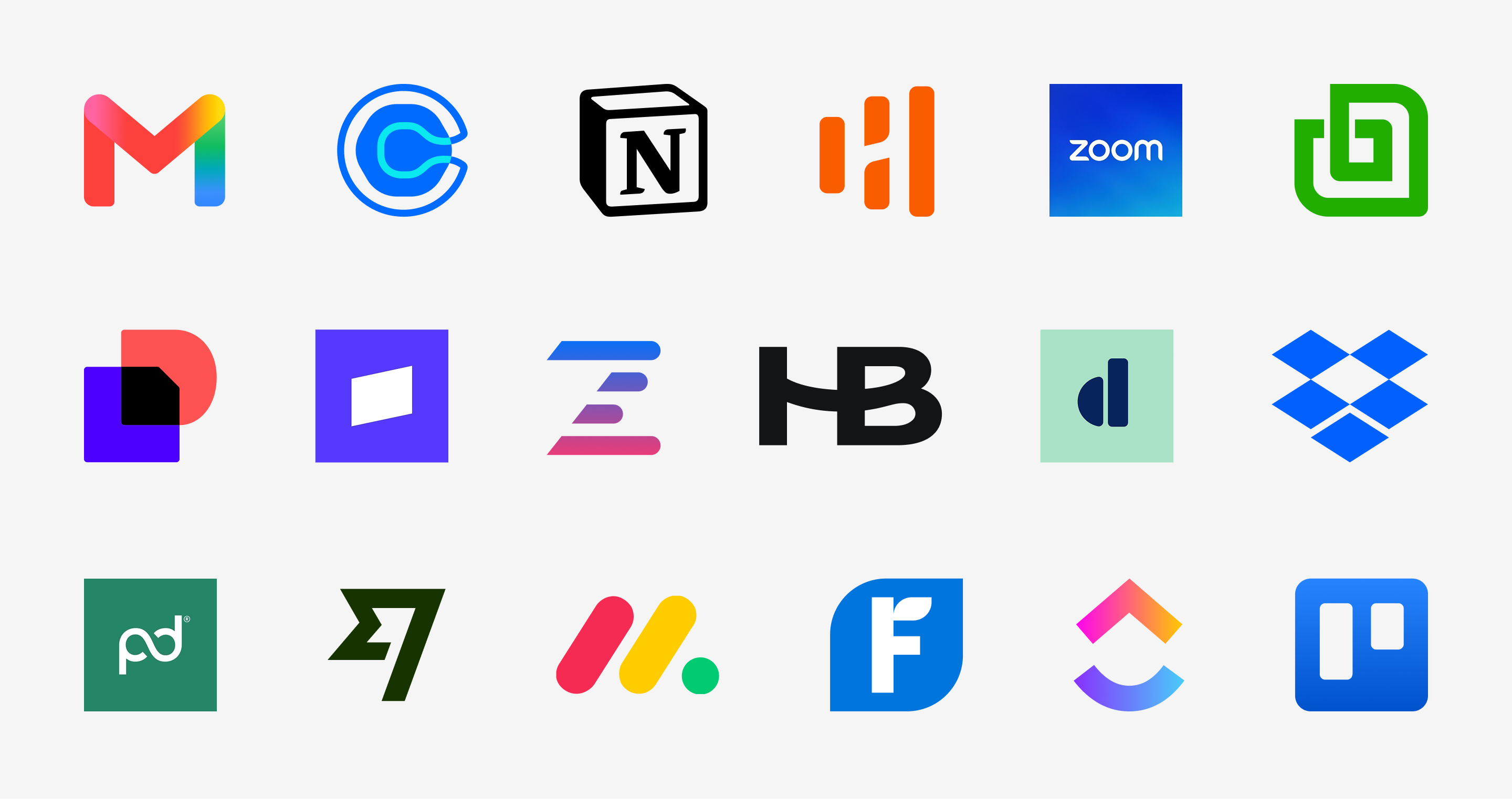
My own freelance project was the ground truth. One job, a website with logo and branding, run across email and messages for approvals, Dropbox and Google Drive for files, and Zoom for calls. Nothing was broken. Everything was somewhere else.
One person's bad month is not a market, so I read how freelancers describe running their businesses in their own words. The same complaints kept surfacing. Approvals live in email, so nothing moves until someone digs a decision out of a thread. Onboarding is chaos. Payments come late. And the brand suffers, because a client meeting five different interfaces reads five different companies.
Underneath all of it is one thing: fragmentation. The tools are fine. The seams are the product.
The Notion pattern sharpened it. Freelancers keep building client portals in Notion for control over the layout, then still pay for everything else to run the business. They were buying control with setup time and extra subscriptions. Whatever I built had to be fast to set up as well as complete, or it would just become the sixth tab. Fast to set up meant reusable starting points, which is why templates became a first-class part of the product rather than a settings page.
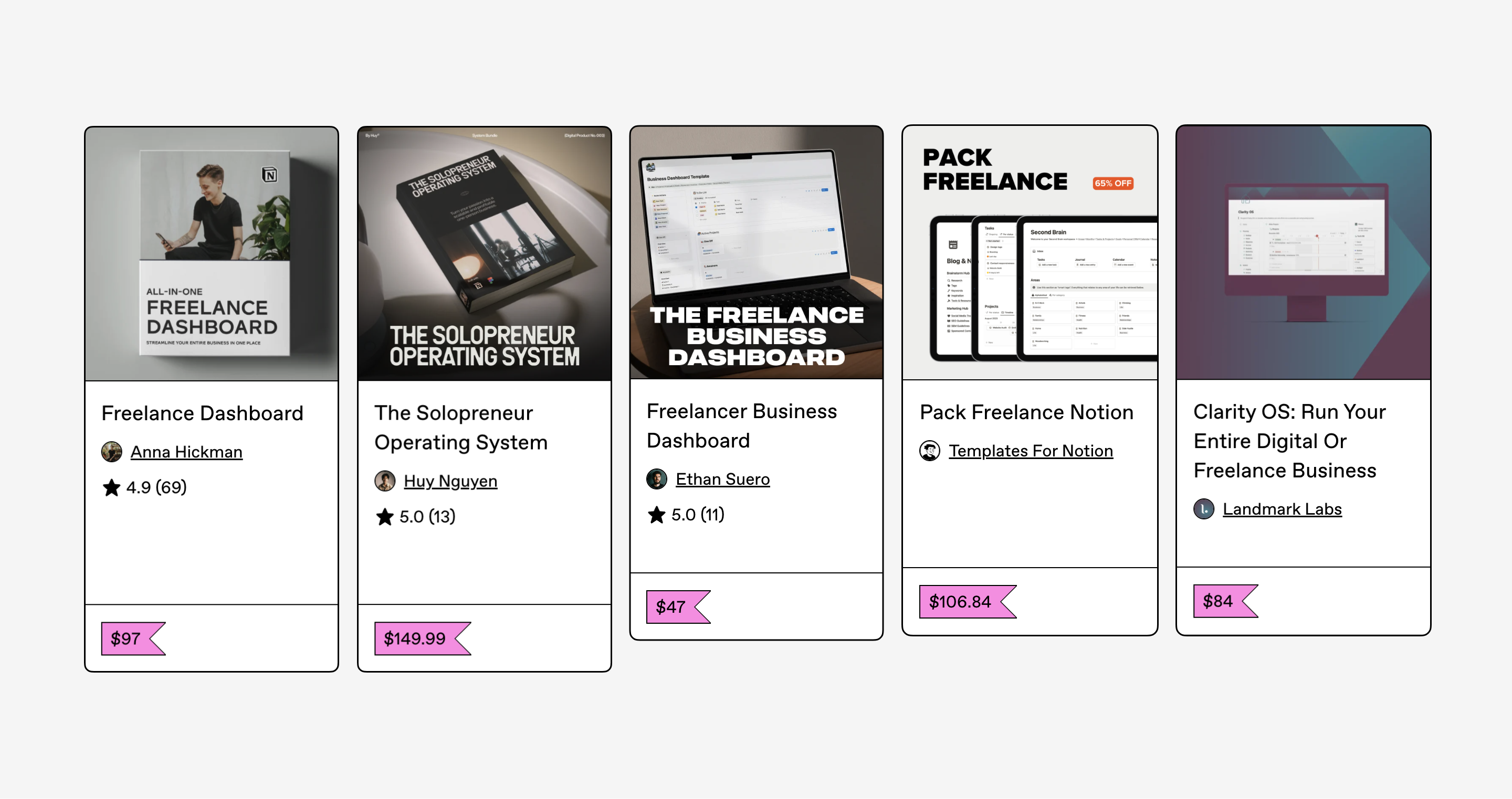
ThHen I went through what already exists: Bonsai, HoneyBook, SuiteDash, SuperOkay, Copilot, Dubsado, Plutio, Moxie.
Every one of them sits somewhere on the same tradeoff: depth of features against quality of the client experience. SuiteDash is genuinely all-in-one and its client-facing side reads like internal software. SuperOkay is built around presentation and has no invoicing, contracts, or payments, so you keep the rest of your stack anyway.
Plenty of products are trying to fix this. What I wanted to see was which parts each one goes deep on and which it treats as an afterthought.
Two questions carried the rest of the project. How do you put the entire client relationship in one place, from signing to paying to reviewing to talking? And how do you serve two people with opposite needs, the freelancer and their client, without building two products?
What I refused to build
Before designing anything I wrote a brief, because I wanted a clear picture of what I was building. The hardest part of it was not the feature list. It was deciding how deep each feature was allowed to go.
Every feature request in this category sounds reasonable, which is how these products end up bloated. Canopy plans projects, but it does not do Gantt charts or sprints, because a client does not need a critical path. It invoices, but it does not keep books, because a general ledger is a different product and FreshBooks already is one. It tracks a pipeline, but it is not a CRM, because this is about the relationship after the deal is signed. Native apps, video hosting, and AI-generated contracts were out entirely.
The Notion templates showed me where to stop. None of them have a general ledger. What they have is a way to track invoices, payments, and expenses, because that is the part a freelancer actually opens. Bonsai and SuiteDash are built for people with years of practice or a team to delegate to. Canopy is for one person, so every feature only goes as deep as one person will use.
Then I looked at what freelancers build when nobody gives them a tool. The Notion templates people sell to each other are full systems: client portals, CRMs, project managers, invoice trackers. What every one of them also has is a running list of what needs doing. That is where Today came from. Neither of the AI outputs proposed it, and it became the landing page.
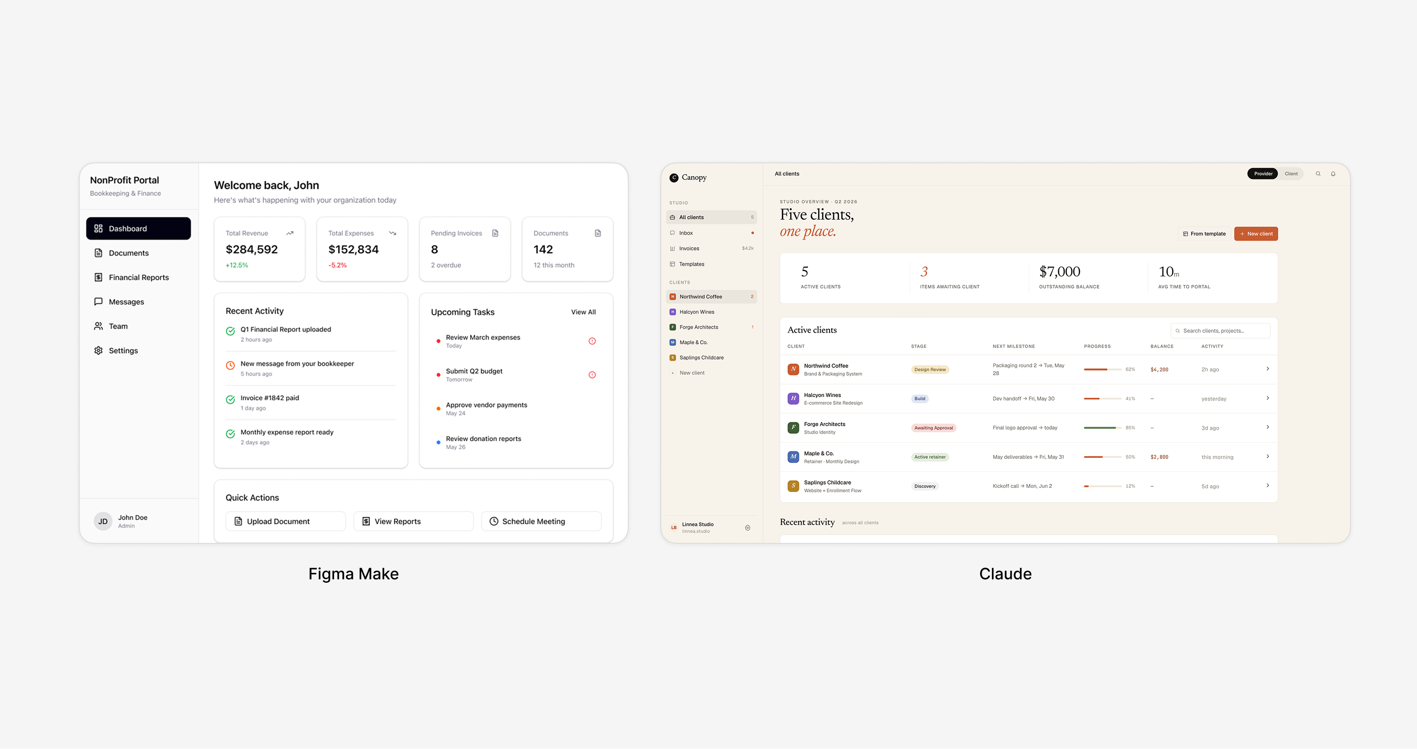
I handed the brief to Figma Make and Claude as a check on the spec. Claude built close to what I intended, a client roster with each client opening into a workspace of their own. Figma built a bookkeeping and finance dashboard. The useful part was confirmation that the shape held up; the rest of what I learned from those tools is in the reflection.
So the structure came from three places. What actually happens across a project, walked end to end: the client signs, work starts, files go out for review, someone owes an answer, an invoice goes out, scope changes. What the existing products cover. And what freelancers had already built for themselves.
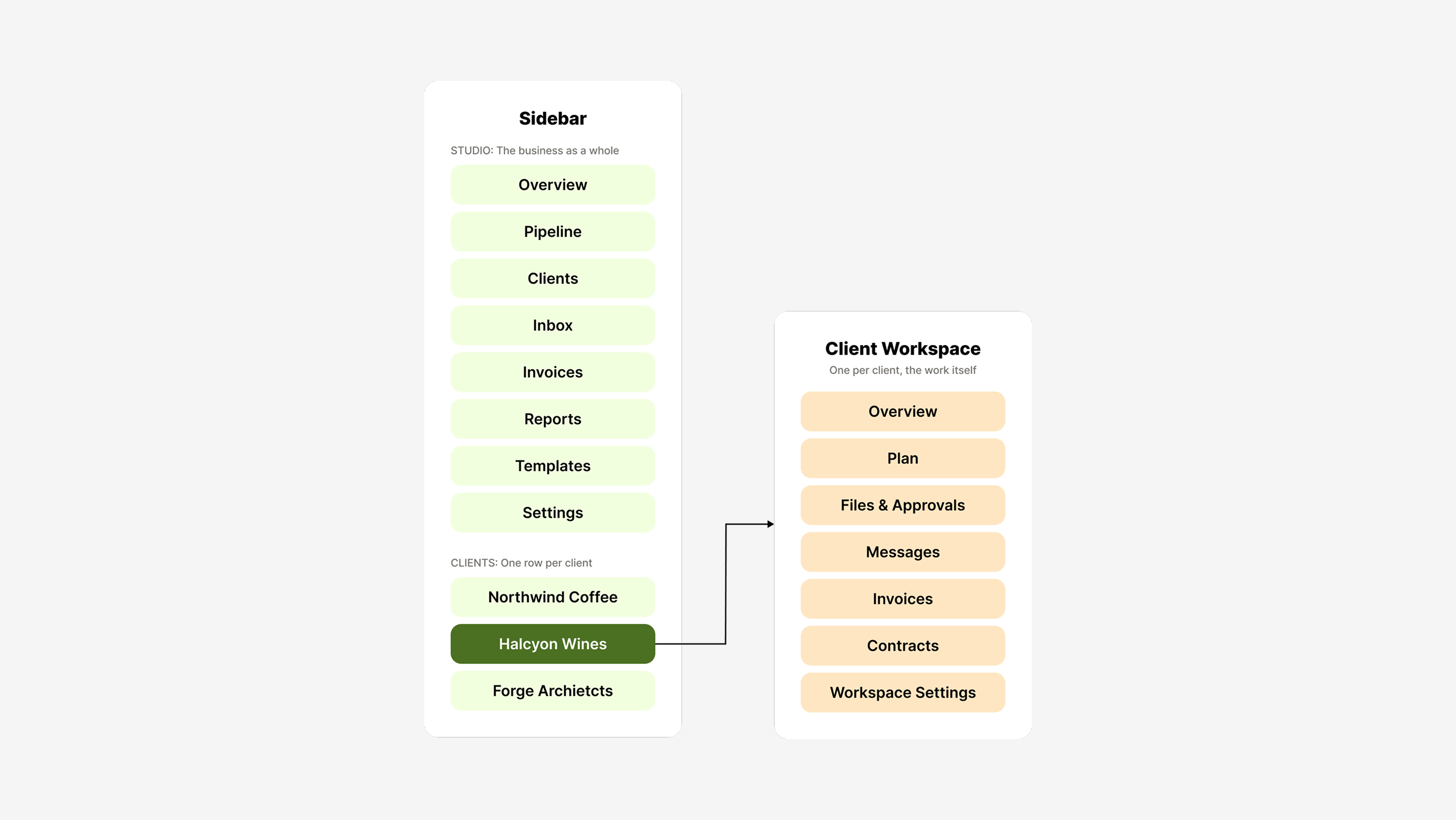
The answer was everything at once, split two ways. Eight studio pages for the business as a whole, and seven tabs inside every client workspace for the work itself.
Knowing when to stop
Three decisions, and all three came down to the same question: how much does a freelancer need to see here, and at what point does more stop helping?
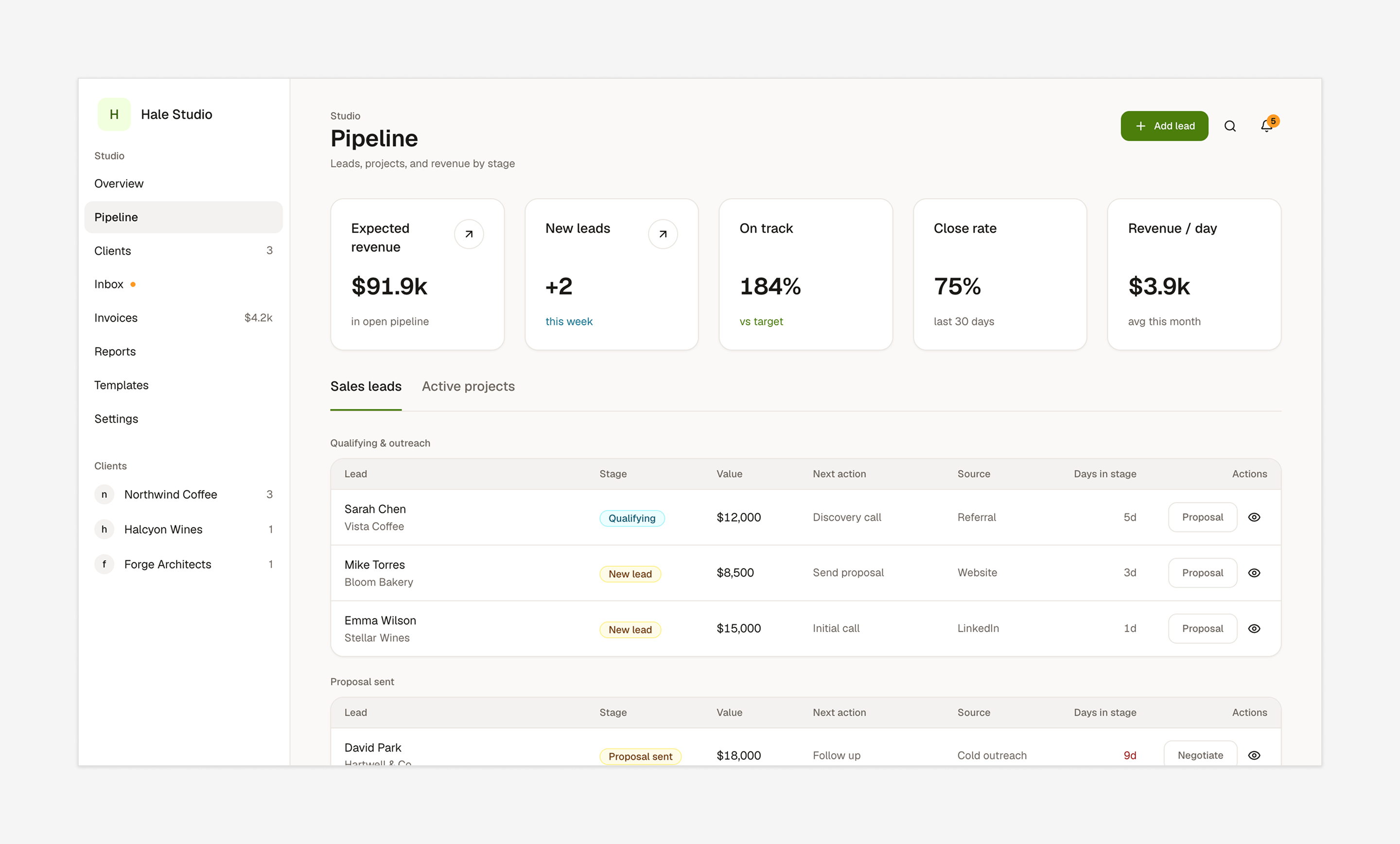
Held: a stat row on the pages that have something to track
Choosing the numbers was the slow part. Pipeline took the longest, because that page is where someone finds out whether the next few months are going to work: expected revenue in what is open, how they are tracking against target, close rate over the last thirty days. The test I settled on was whether a number changes what you do next. New leads this week barely passed it and may not survive the next round.
Held: four templates for the first build
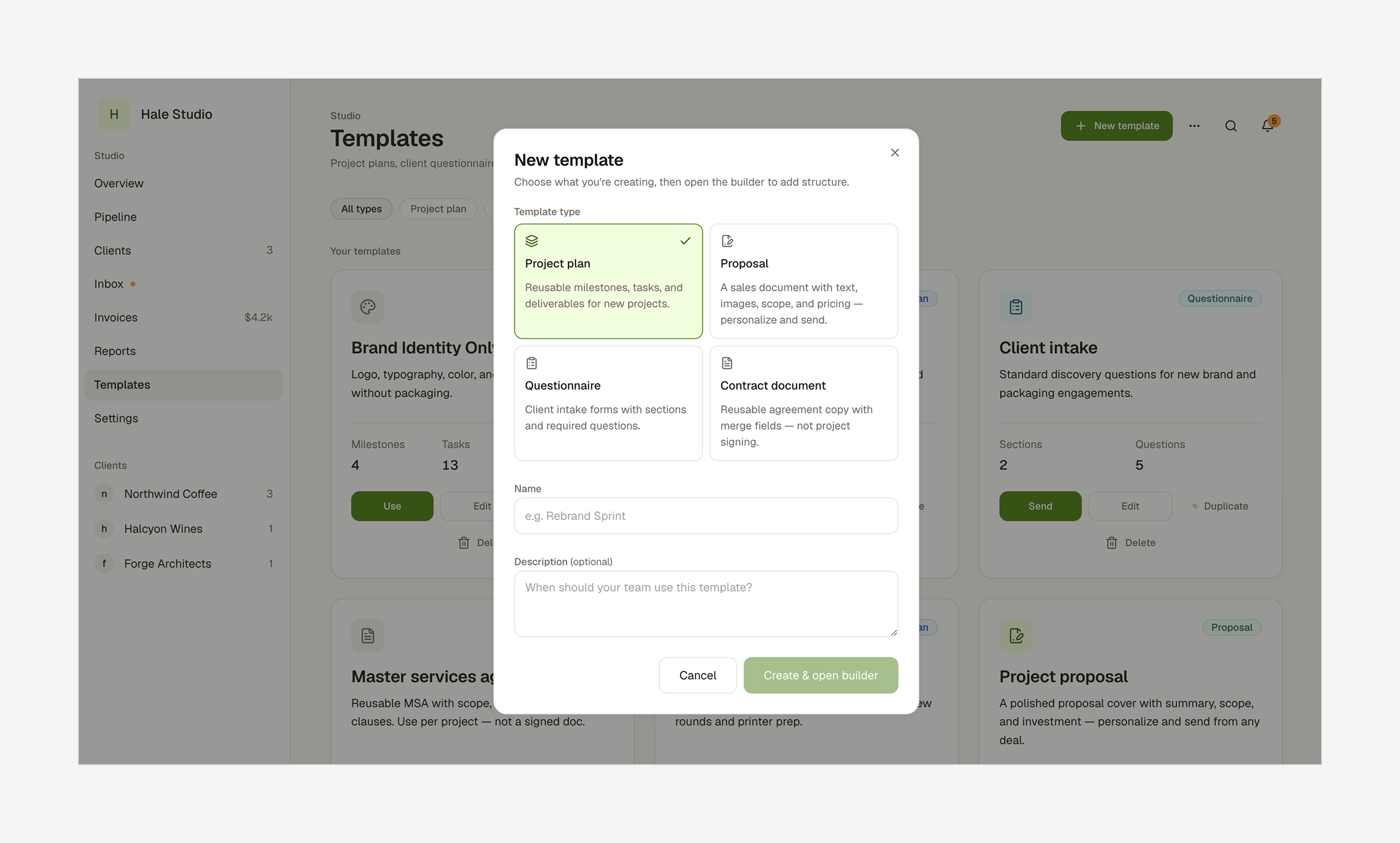
Four was a scope decision for a first version. Every template is another builder to design and another set of fields to keep consistent with the rest of the system. The more useful next step is probably not a fifth document but the option to start from blank.
Split: hours in two places, at two depths
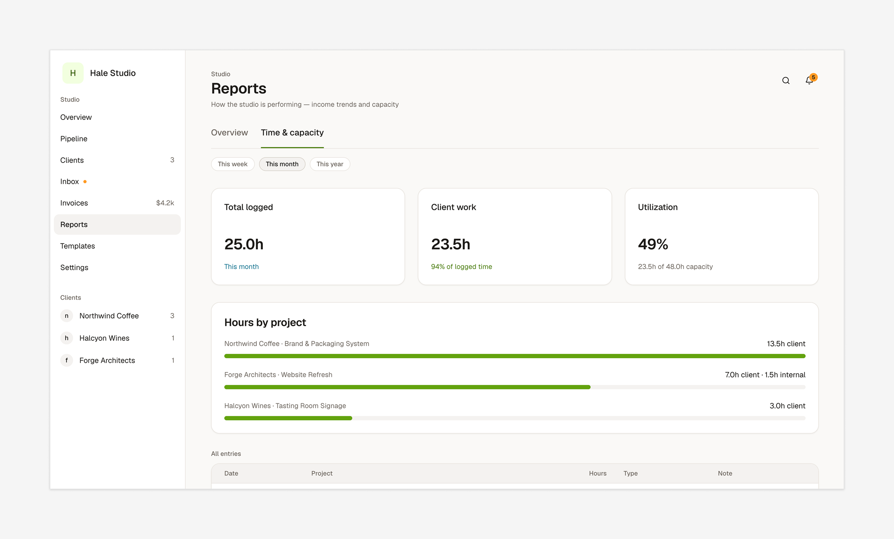
The longer view lives in Reports because the question hours really answer is not a daily one. It came from watching a freelancer describe being stuck between working faster and charging more, and tracking time is how you find out which one you are facing. That is a question you ask every few months, and putting the full picture on the landing page would have made it look like one you ask every morning.
It runs. Nobody has used it.
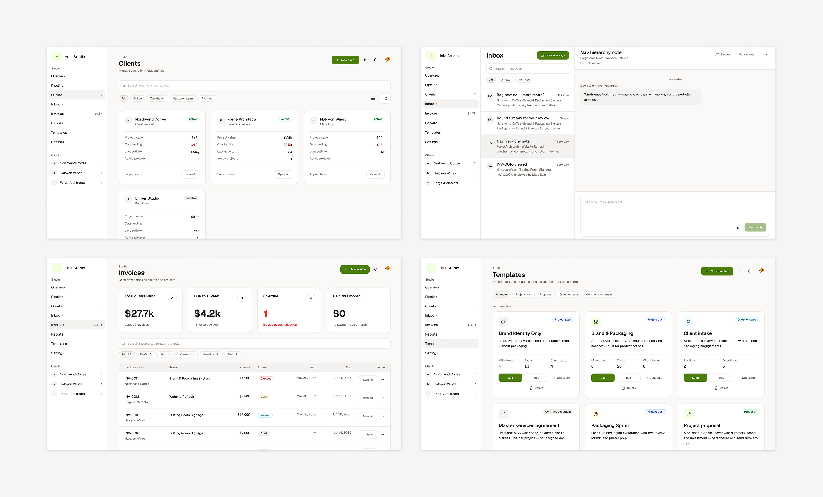
Everything you can click is real interface. Seven studio pages plus settings, seven tabs inside every client workspace, and builders for all four templates. Stat rows, a command palette, breadcrumbs and search on every page, and notifications. Demo clients and projects you can navigate start to finish. Front end only, on a token-driven design system.
The backend is deliberately later. Prove the product model first, then build the backend.
The honest gap is that no freelancer other than me has used it. That comes first: putting the studio in front of working freelancers, watching them run real projects through it, and fixing what breaks.
I already have one thing on that list. Every client workspace has a Messages tab, and the sidebar has an Inbox. Having messages inside the workspace felt convenient when I built it. Now it looks like the same conversation in two places, and I want to watch someone use both before I cut one.
The client portal is the next design problem and none of it exists yet. I have only ever been on the freelancer's side of this relationship, so while freelancers test the studio I will be asking about the other side. After that, the backend: real auth, payments, and file storage.
The deciding did not get faster
Figma Make and Claude got me to something I could click in an afternoon. Structural problems do not show up in a static frame, they show up when you try to move through the thing, and having a prototype that early meant I found them while they were still cheap to fix.
Neither tool made a decision. I still had to choose what went in, what came out, and how deep each thing went, and that part did not speed up at all. It ran on research and on working out what a freelancer actually does in a day.
Figma made that clear. My brief named freelancers in the title, the subtitle, and the audience field, and it still built a bookkeeping dashboard. It took nine rounds of prompting and correcting before it was close to usable.
The other thing this taught me is what AI is for when you work alone. There is no design lead to turn to and no teammate across the desk, so when I was stuck I asked for a professional opinion the way I would ask a colleague. I take what it says with a grain of salt and follow it with my own research, but it reliably gave me a different angle, and sometimes that is all it takes to get moving.
AI stood in for a colleague. Nothing stood in for a user. I made every decision in this project alone, and the ones I am least confident about are the ones a working freelancer would have settled in ten minutes. That is the part I want to fix first.